Preview image. Unlock full-res
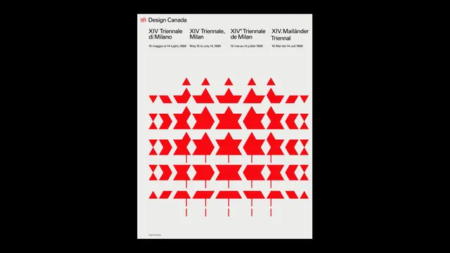
A modular geometric identity system for Design Canada featuring a red maple-inspired logo and rows of combinable triangular forms.
Summary
A modernist identity system for Design Canada's 1968 Triennale di Milano participation, built from a geometric red logo and modular triangular forms that recombine across multiple rows.
Visual description
At the top, the Design Canada wordmark (a stylized red maple-leaf-like form) sits beside event text listing the Triennale variations and dates. Below, five stacked rows of bright red geometric shapes—primarily isosceles triangles, diamonds, and composite forms—create a pattern grid. Each shape is a discrete module, suggesting they can be reassembled into different configurations. The composition uses a soft beige/cream background with tight black text labeling (dates, variations) and sits on a minimal field.
Key takeaway
The power of modular geometry in identity: a single set of elementary shapes (triangles at different scales and rotations) creates visual richness and flexibility without requiring multiple mark variations. The color discipline (one bright red plus black type) makes the system instantly legible.
Reuse notes
Strong reference for systematic, typographic identity work, especially for cultural institutions or national design bodies. The modularity suggests printable variations and dynamic applications. The 1960s Swiss modernism aesthetic reads as authoritative and timeless.
More like this




Keep what you find
A free account saves references to boards and can send you a weekly email of picks based on what you save.
To see every result, go Pro.