Preview image. Unlock full-res
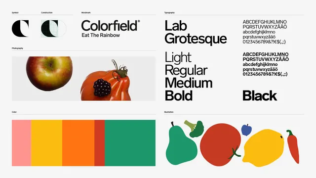
A single landscape summary board laying out the Colorfield symbol and its construction grid, the wordmark, the type family, photography, the color bar and the produce illustration set.
More like this
See all

Summary
An entire identity compressed onto one board: symbol, construction, wordmark, typeface, photography, palette and illustration, each in its own labelled cell under a hairline rule.
Visual description
Light grey board divided into two vertical halves by whitespace, each half split into stacked cells. Every cell is introduced by a tiny lowercase-height label in black sans-serif (Symbol, Construction, Wordmark, Photography, Color, Typography, Illustration) sitting above a full-width hairline rule. Top left shows the black C symbol solid, then the same letterform overlaid on a fine green construction grid with circle guides. Beside it the wordmark Colorfield in medium-weight grotesque with a registered mark, and under it the tagline Eat The Rainbow. Below, a wide photography strip on pale grey shows a cut apple and a ribbed heirloom tomato with a blackberry resting on it, both silhouetted. The color cell is a single horizontal bar split into five unequal blocks: salmon pink, yellow, orange, a narrow red and a wide green. The right half is given to type: the name Lab Grotesque set very large, the weight names Light, Regular, Medium and Bold stacked beneath it, a character set in upper and lowercase with numerals and punctuation shown at two weights, and the word Black set heavy at lower right. The bottom right cell holds five flat produce illustrations in a row: a green pear, broccoli, a red tomato, a yellow lemon and a red chilli, plus a small blue apple.
Key takeaway
Labelled cells over hairline rules let one board carry seven different asset types without any of them competing. Showing the symbol next to its construction grid immediately signals a system rather than a drawing.
Reuse notes
A strong template for a case-study summary frame, a portfolio slide, or the overview page of a brand guideline. Works best when every element is genuinely resolved, since the flat grid gives nothing anywhere to hide. Note the unequal color bar: proportions there are doing double duty as a usage ratio.
More like this

Keep what you find
A free account saves references to boards and can send you a weekly email of picks based on what you save.
To see every result, go Pro.