Preview image. Unlock full-res
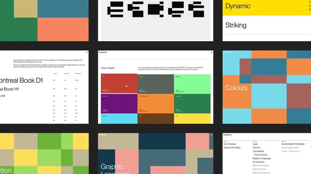
Nine brand guideline pages tiled on a dark ground, covering logo grids, type specs, the color palette and the graphic language.
More like this
See all

Summary
An overview frame of the brand's digital guidelines, laid out as a three by three grid of page screenshots on black so the whole system reads in one look.
Visual description
Nine light pages float on a near-black background in a loose grid, cropped at the left and right edges. The top row shows a color block composition, a row of five letterforms built on a fine construction grid in black on light grey, and a stack of full-bleed statement rows where "Dynamic" sits on yellow and "Striking" on white. The middle row shows a typography page with body copy about a grotesque face and a table of font size, line height and letter spacing values beside oversized specimen lines; a color palette page titled Colour Palette with a note about limiting a design to one to three colors, followed by nine swatch tiles each labelled with a name and hex and RGB values, red, dark grey, mint green, dark purple, construction orange, forest green, sky blue, brown, gold; and a page headed Colours built from the same swatches as a full mosaic. The bottom row shows another color grid, a page headed Graphic Language with the wordmark top left, and a contents page with three labelled columns of section links, some active and some greyed. Every page carries the small "Euphemia" wordmark at the top left and a menu icon at the top right.
Key takeaway
Presenting guidelines as a tiled grid rather than a carousel proves the system's consistency in one frame, because the repeated header, the recurring swatches and the same grid logic are visible across all nine pages at once. Naming each color and pairing it with a usage rule keeps a very wide palette usable.
Reuse notes
Use as a model for a case study slide that has to summarize a whole guidelines site, or as a structure for a web based brand center. The nine up grid only works if the pages are visually distinct; near-identical pages will read as a texture. Individual page crops are more legible than this overview for detail work.
More like this


Keep what you find
A free account saves references to boards and can send you a weekly email of picks based on what you save.
To see every result, go Pro.