Preview image. Unlock full-res
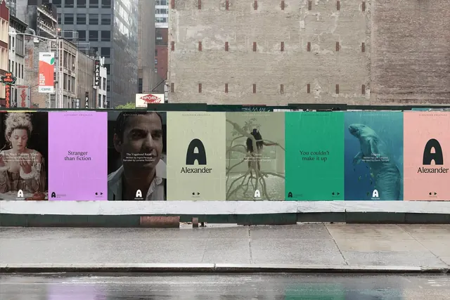
A row of muted, color-tinted film posters for a brand called Alexander, each carrying a serif A monogram, wheatpasted across a plywood construction hoarding on a wet city street.
Summary
A poster series for a brand named Alexander, mocked up as a wheatpasted hoarding on a city street, where each panel pairs a duotone-tinted image with the same serif A monogram. The defining idea is one quiet identity system flexing across many tones while staying instantly recognizable.
Visual description
Eight tall posters run in a continuous strip along a plywood construction hoarding, set against gray brick buildings with a wet, reflective sidewalk in the foreground. Each poster is flooded with a different muted tint, lavender, sage, olive, teal, deep green, dusty pink, so the photographs (a costumed period figure, a bearded man, a monkey on branches, a polar bear underwater) read as monochrome washes. Every panel carries a serif capital "A" or the full "Alexander" wordmark, small body copy, and a pair of tiny triangular play markers, suggesting episodic or film content. Headlines like "Stranger than fiction" and "You couldn't make it up" appear in restrained serif type. The consistent layout grid and shared monogram unify panels despite their differing imagery and color.
Key takeaway
Unify a varied image library by flooding each photo with a single brand-adjacent tint and overlaying a consistent serif monogram and grid; the color does the heavy lifting while the layout stays identical. Mocking the series onto a real street hoarding sells the rollout in context and shows how the rhythm reads at environmental scale. The pair of small play triangles quietly signals a streaming or video product without a loud UI.
Reuse notes
A useful reference for a streaming service, film studio, festival, or publisher rolling out an episodic campaign across OOH and social. The tinting trick rescues mismatched or licensed imagery, but choose tints that hold contrast for legibility. Present the system on a contextual mockup like this hoarding to communicate cadence and scale to stakeholders.
More like this



Keep what you find
A free account saves references to boards and can send you a weekly email of picks based on what you save.
To see every result, go Pro.