Preview image. Unlock full-res
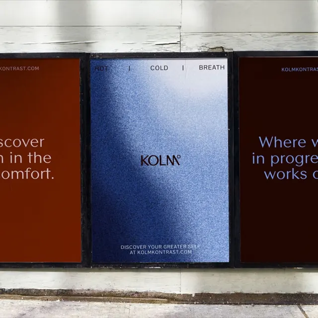
Three side-by-side outdoor posters for KOLM contrast a grainy blue gradient center panel against two deep rust-red flanking panels, themed around hot, cold, and breath.
Summary
A wellness-brand campaign shown as three mounted posters in a row, where the central grainy ice-blue gradient panel carries the KOLM mark and is flanked by two oxblood-red panels of headline copy.
Visual description
The trio is mocked up on a pale concrete wall, each poster set in a thin black frame. The center poster is a noisy, textured gradient running from deep blue at the corners to a near-white glow in the upper third, evoking frosted glass or cold breath. Across its top in small tracked caps: "HOT | COLD | BREATH". Centered on it is the wordmark "KOLM" with a small degree symbol, and at the bottom a two-line micro tagline "DISCOVER YOUR GREATER SELF AT KOLMKONTRAST.COM". The two outer panels are flat deep rust-red, partially cropped by the frame edge, carrying large blue serif-light headline fragments ("...scover ...in the ...omfort." on the left, "Where w... in progre... works..." on the right) plus the small "KOLMKONTRAST.COM" url top-right. The palette is a tight duotone of rust and cold blue with a grainy film texture unifying all three.
Key takeaway
Letting one campaign breathe across three panels, with a textured cold-gradient hero between two flat warm slabs, builds a hot-versus-cold tension straight from the color system rather than imagery. The uniform film grain over both the gradient and the flat fields ties disparate panels into one family. A small degree symbol on the wordmark quietly reinforces the temperature theme.
Reuse notes
Reach for this when a wellness, sauna, cold-plunge, or recovery brand needs an out-of-home or campaign system that feels premium and editorial without photography. The rust-and-blue duotone is the whole idea, so it only works where you control both colors. Grain texture is essential; on flat fields the panels would feel cheap.
More like this





Keep what you find
A free account saves references to boards and can send you a weekly email of picks based on what you save.
To see every result, go Pro.