Preview image. Unlock full-res
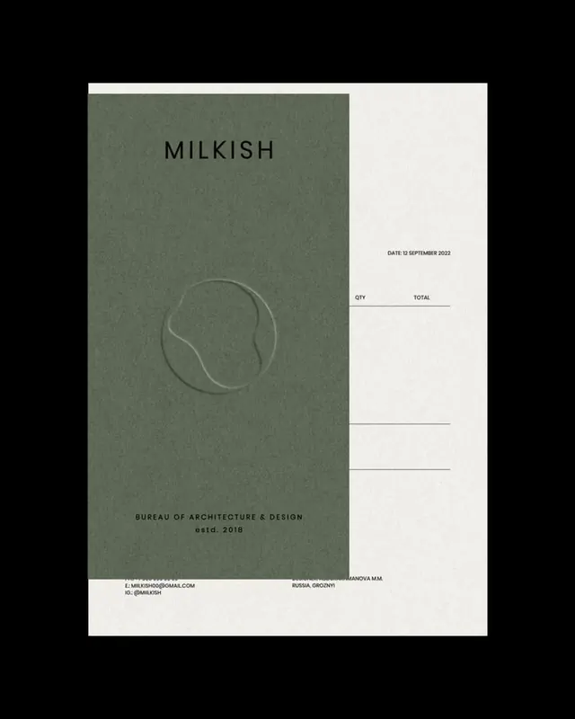
A minimalist olive-green stationery layout for architecture bureau MILKISH, pairing a blind-embossed organic seal with a quiet sans-serif order form ruled with empty QTY and TOTAL lines.
Summary
A stationery and order-form layout for the architecture bureau MILKISH, built on a tall olive-green panel with a blind-embossed organic seal and a restrained sans-serif order form alongside.
Visual description
On a flat black background two layered sheets sit slightly offset. A tall olive-green card carries the spaced-out wordmark "MILKISH" near the top, a tonal blind-embossed seal of a soft organic blob inside a circle at its center, and "BUREAU OF ARCHITECTURE & DESIGN / estd. 2018" plus phone, email and Instagram contact lines at the foot. Behind and to the right an off-white sheet acts as an order form: "DATE: 12 SEPTEMBER 2022" at top, then "QTY" and "TOTAL" column headers above several thin empty ruled lines waiting to be filled. The type is uniformly small, light, and all-caps; hierarchy comes from spacing rather than size.
Key takeaway
Letting a debossed, tone-on-tone organic mark carry the brand instead of a printed logo, so texture does the work color does not. Pairing a closed brand panel with an open, fill-in order form unifies identity and functional paperwork in one system.
Reuse notes
A template for architecture, interiors, or studio practices that want quiet, paper-forward stationery. The muted olive plus off-white plus blind emboss reads premium in print and photographs well in mockups. Best where the brand can afford real embossing or a convincing simulation of it.
More like this


Keep what you find
A free account saves references to boards and can send you a weekly email of picks based on what you save.
To see every result, go Pro.