Preview image. Unlock full-res
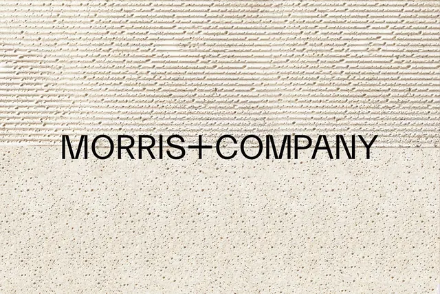
Centered MORRIS+COMPANY wordmark in black sans-serif sitting on the seam between a fine handwritten-script texture above and a speckled terrazzo-like ground below, all in warm cream.
Summary
A wordmark study where MORRIS+COMPANY is set in tight black all-caps sans-serif and placed exactly on the boundary line between two contrasting cream textures.
Visual description
The frame is split into horizontal bands of nearly the same warm cream value. The top band is a dense field of fine, repeating handwritten-script marks, almost a ruled-paper or longhand texture. The lower band is a flat speckled surface like fine terrazzo or paper stock. The logotype straddles the seam, set in a clean geometric sans with very tight letter-spacing and a literal plus sign linking the two words. Color contrast is minimal; the whole composition is tone-on-tone cream, so the design reads through texture and the single black logotype rather than through hue.
Key takeaway
Differentiating zones by material texture instead of color: two surfaces at the same value, separated only by their grain. Then anchoring the logotype precisely on the dividing line so the mark belongs to both halves. The plus as a connector is a quiet, reusable way to join two words.
Reuse notes
Ideal for architecture, interiors, or studio branding that wants restraint and tactility. The tone-on-tone, texture-driven approach photographs beautifully on physical stationery and business cards. Caveat: contrast is so low it needs good print or screen reproduction, and the black logotype is doing all the legibility work.
More like this




Keep what you find
A free account saves references to boards and can send you a weekly email of picks based on what you save.
To see every result, go Pro.