Preview image. Unlock full-res
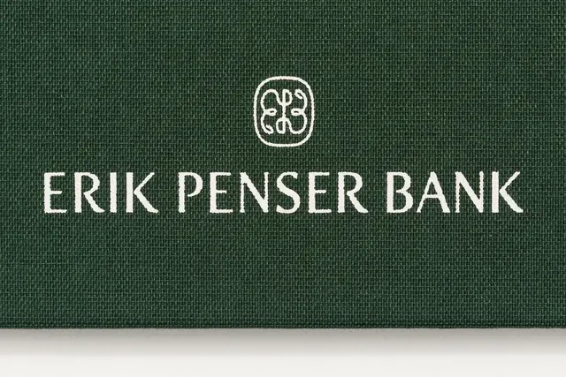
The Erik Penser Bank identity stamped in white on dark green woven bookcloth, pairing a classic high-contrast serif wordmark with a small ornate monogram crest above it.
Summary
A private-bank identity shown applied to material: "ERIK PENSER BANK" in a classic high-contrast serif, printed white on a dark green woven bookcloth cover, with a small ornate monogram crest centered above the wordmark.
Visual description
The frame is a macro photograph of a deep forest-green book or folder cover, the woven linen weave of the cloth clearly visible across the whole surface. Centered in the upper-middle sits a small rounded-square crest containing a symmetrical interlaced monogram in fine line work. Below it, "ERIK PENSER BANK" runs as a single all-caps line in an elegant serif with strong thick-thin contrast, bracket serifs, and a generous letter-spacing that reads as engraved or foil-stamped rather than printed. Everything is white-on-green and centered, with a slim sliver of the off-white page block showing at the very bottom edge. The texture of the fabric and the restraint of the lockup do the work, no other graphics appear.
Key takeaway
Showing an identity on a tactile substrate: photographing the wordmark on textured green bookcloth makes a simple serif-and-crest lockup feel heritage-grade and physical. The pairing of a delicate interlaced monogram with a wide-spaced serif is a reliable formula for old-money, trust-driven brands.
Reuse notes
Reach for this for private banking, law, wealth, or any brand selling discretion and longevity. The effect depends on the material and the high-contrast serif, so it needs real production (foil, deboss, good cloth) or a convincing texture mockup to land. Pairs well with cream stationery and muted secondary palettes.
More like this





Keep what you find
A free account saves references to boards and can send you a weekly email of picks based on what you save.
To see every result, go Pro.