Preview image. Unlock full-res
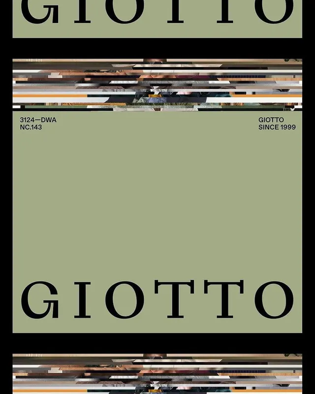
A sophisticated heritage-brand system pairing a bold serif wordmark with a muted olive-green palette, established visual language anchored in typographic authority.
Summary
A sophisticated heritage-brand system pairing a bold serif wordmark with a muted olive-green palette, established visual language anchored in typographic authority.
Visual description
A two-page editorial spread from the Giotto brand system (established 1999). The design extends across a dark charcoal background with the large, bold-serif wordmark "GIOTTO" at the bottom in black. Above, a band of layered horizontal stripes—sample imagery of textures and materials—adds visual texture. The background color is a muted olive sage-green. A small metadata block on the right notes "GIOTTO SINCE 1999" and "3124-DWA NC.143" in a refined sans-serif. The layout employs generous negative space and clear grid structure, emphasizing the letterforms and layered depth.
Key takeaway
The harmony between a strong serif mark and a restrained earthy palette. The horizontal stripe treatment adds visual richness without breaking the minimalist discipline. The metadata treatment (small text, high contrast) demonstrates how to layer information without cluttering the primary mark.
Reuse notes
Essential reference for heritage brands seeking authority through typographic weight combined with muted, sophisticated color. The serif-forward approach works well for established luxury, artisanal, or culturally rooted brands. The proportional generosity of negative space around the wordmark is a key strength; avoid overcrowding the mark.
More like this









Keep what you find
A free account saves references to boards and can send you a weekly email of picks based on what you save.
To see every result, go Pro.