Preview image. Unlock full-res
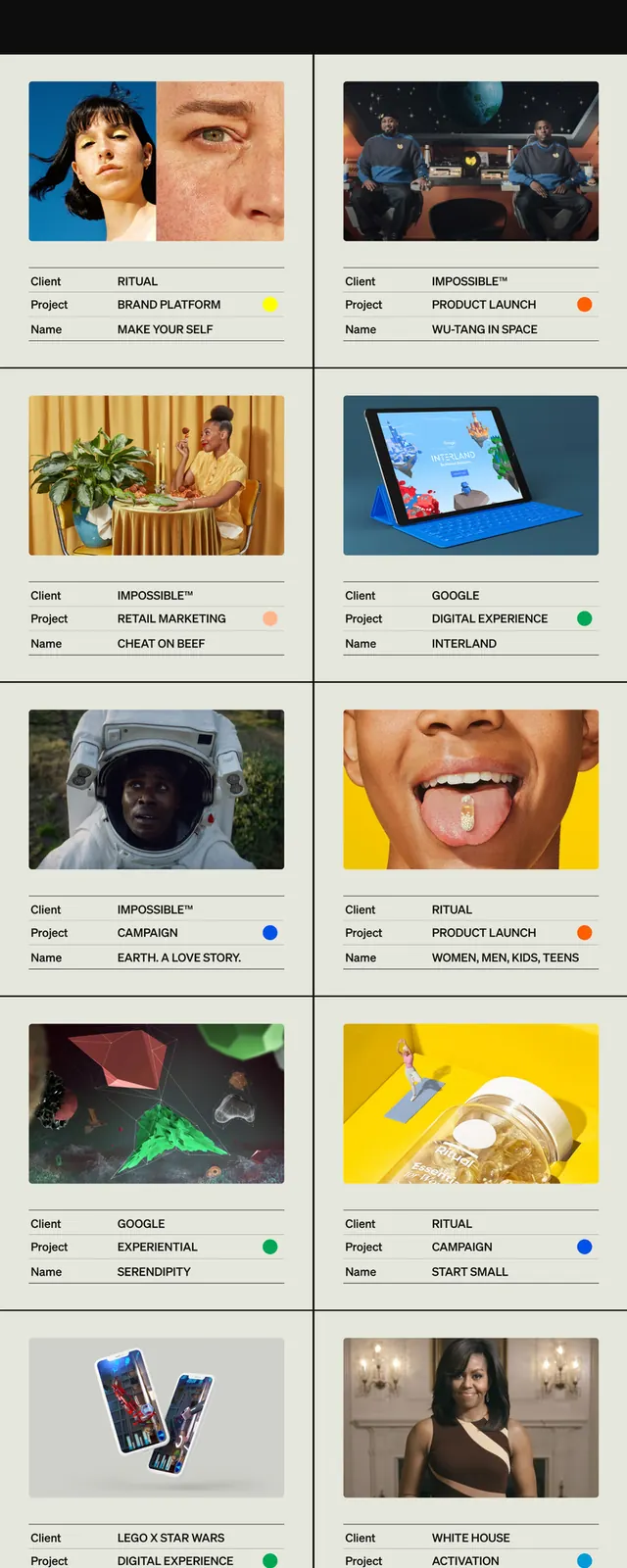
Long-scroll creative-director portfolio in green and black, leading with a bulleted focus list above a two-column thumbnail grid of client work.
Summary
A full-page creative-director portfolio captured top to bottom: a cream intro on green, a black "focus" panel with a color-dotted service list, then a two-column grid of project thumbnails, closing on a green contact block.
Visual description
The header sets a short intro paragraph in dark type on a flat green background. Below, a black band titled "focus" lists service categories (Branding, Campaigns, Product launches, Experiential, Retail marketing, Brand Activations, Content) each prefixed by a small colored dot in a different hue, the only color variety on the page. A thin green arrow points down into the work section: a tidy two-column grid of square photo thumbnails, each labeled with client name and project title in small type, plus a tiny colored status dot. The page closes on a green "Say hello" block carrying a large headline, a lime-yellow smiley emoji, and a stacked contact form. Typography is a single clean sans throughout; green, black, and cream handle all structural and navigational work.
Key takeaway
The colored-dot bullet system that transforms a plain service list into a quiet legend. Those same dots then reappear as status indicators on the work grid, creating a coherent visual thread without adding complexity. Restricting the full palette to green, black, and cream forces the multicolor dots and a single lime emoji to become the entire accent vocabulary, punching their presence with constraint.
Reuse notes
A reliable one-pager structure for independent creatives or studios: hero intro, capabilities capsule, case-study grid, contact call. The locked green-and-black scheme reads confident and builds fast, but the flat color field compresses photographic thumbnails, so the work itself must carry strong visual weight on its own. The colored dots are reusable: swap them to match client or project categories. Keep the smiley or replace it with a single brand mark to shift tone without disrupting the layout.
More like this



Keep what you find
A free account saves references to boards and can send you a weekly email of picks based on what you save.
To see every result, go Pro.