Preview image. Unlock full-res
A 93-page corporate impact/ESG report that pairs soft iridescent gradient covers and Venn diagrams with airy cream data pages set in a mixed roman-and-italic-serif type system.
Summary
Lululemon's 2022 Impact Report, a 93-page corporate ESG/sustainability document. Its personality is the tension between two registers: lush, soft-focus iridescent gradients on the title and section pages, and restrained, airy, data-forward content pages on warm cream, unified by a mixed roman-and-italic-serif type system.
Visual description
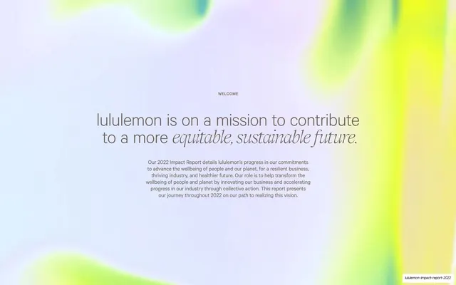
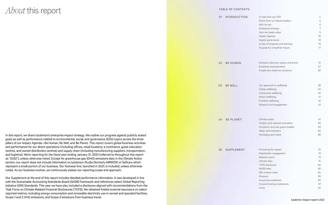
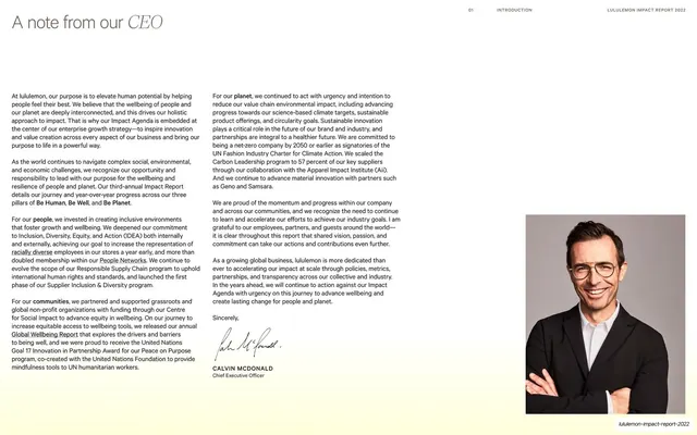
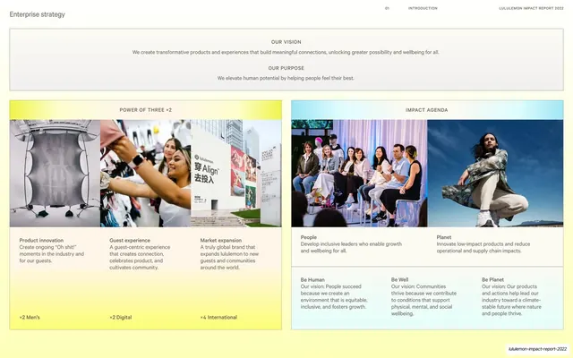
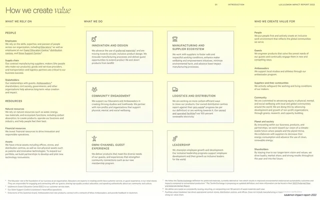
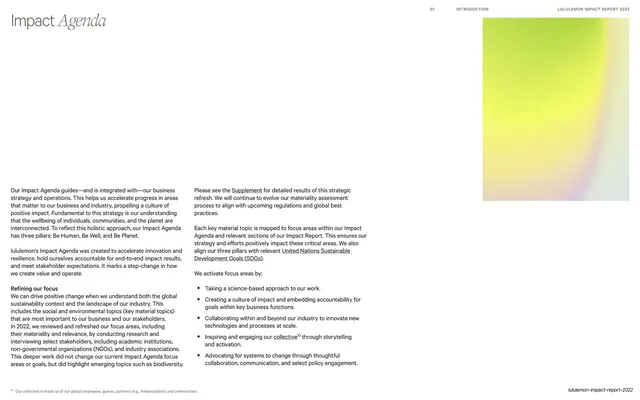
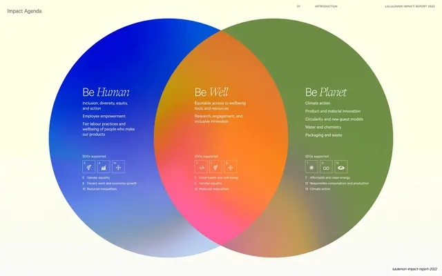
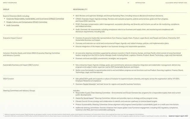
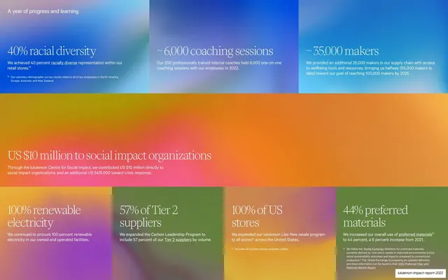
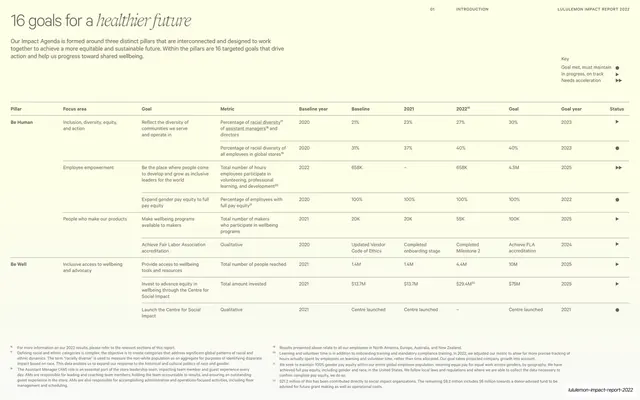
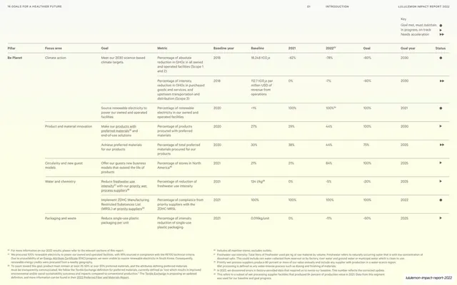
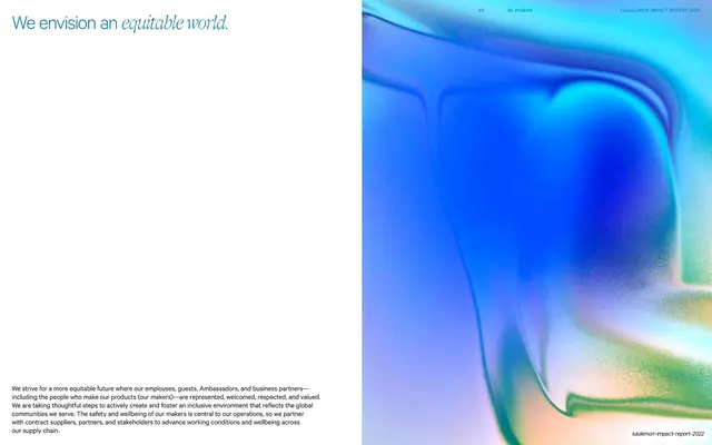
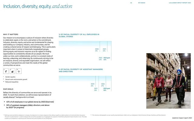
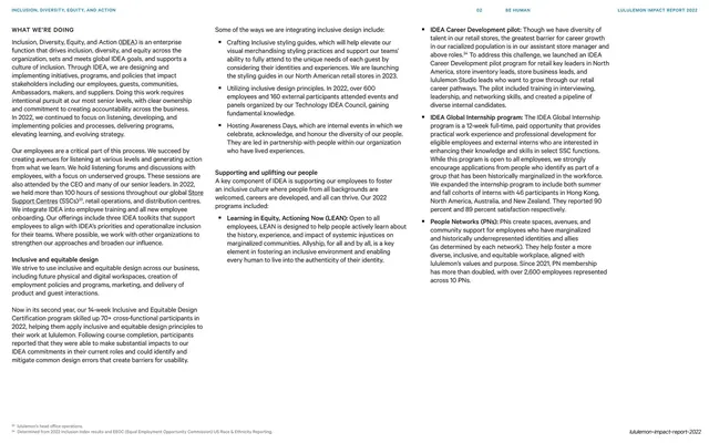
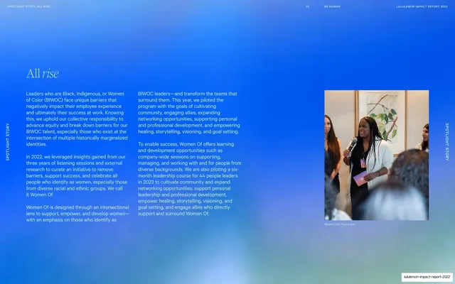
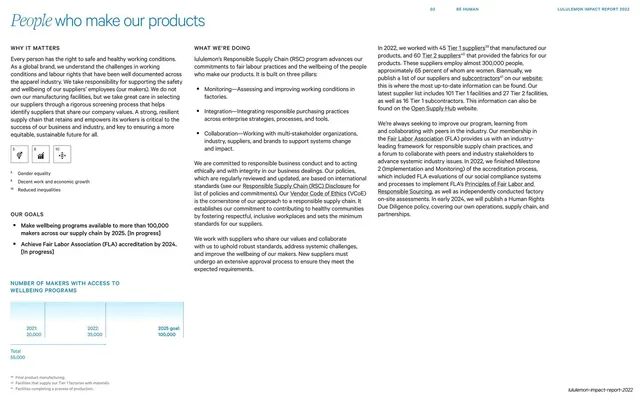
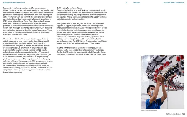
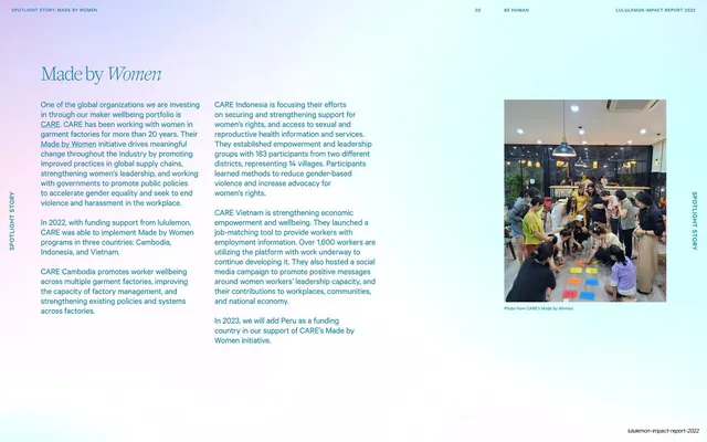
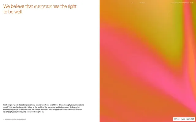
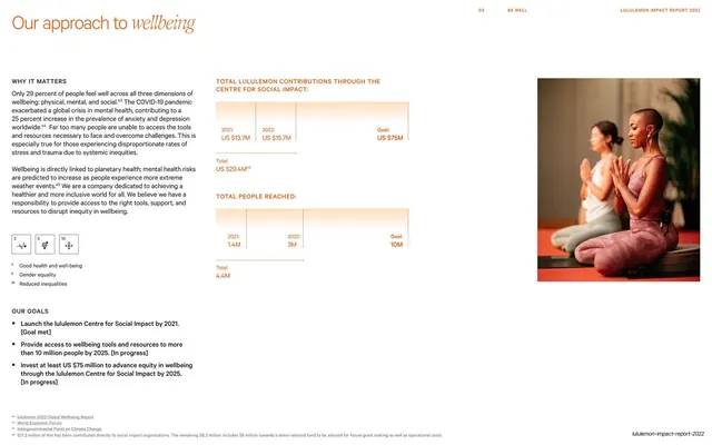
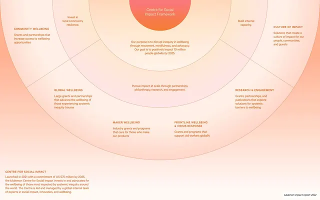
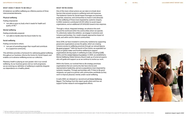
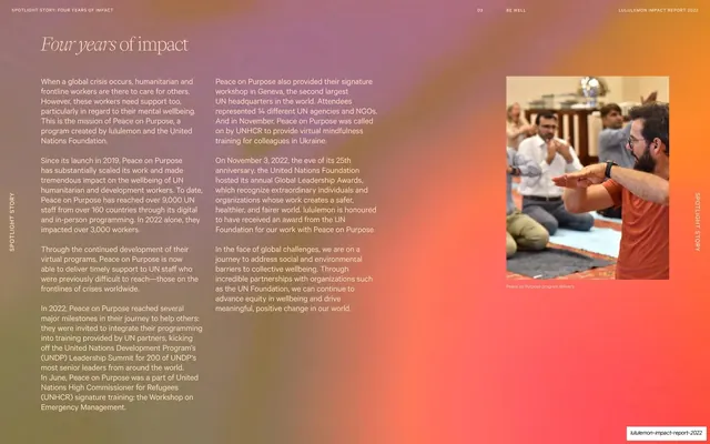
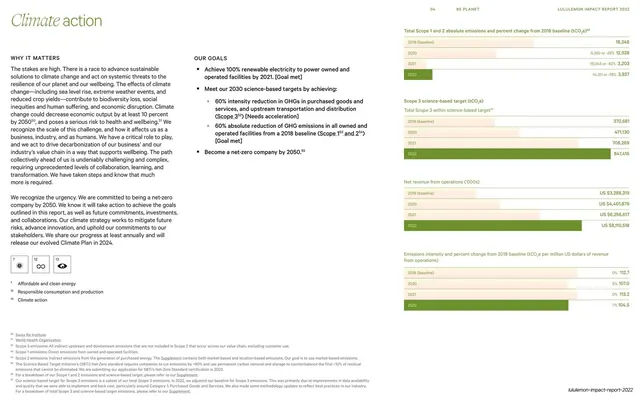
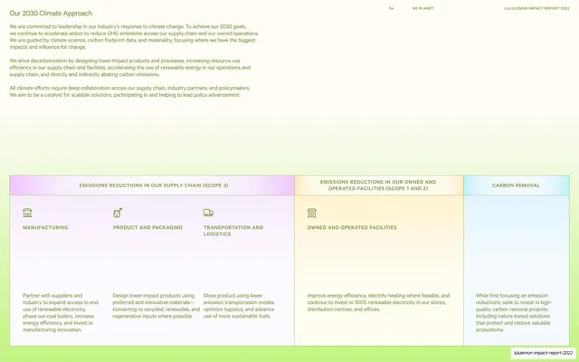
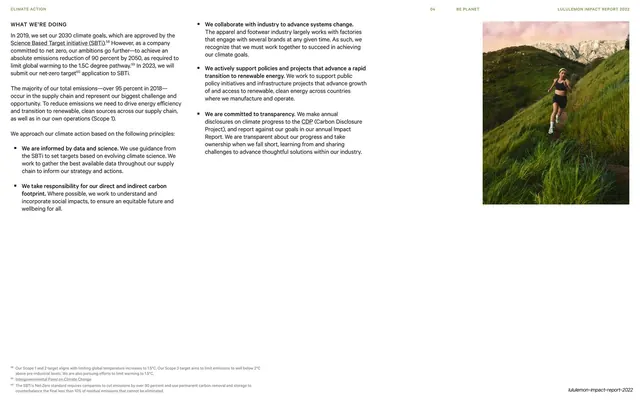
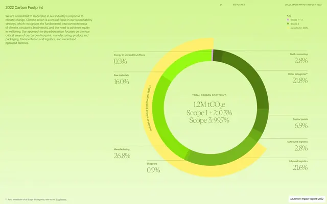
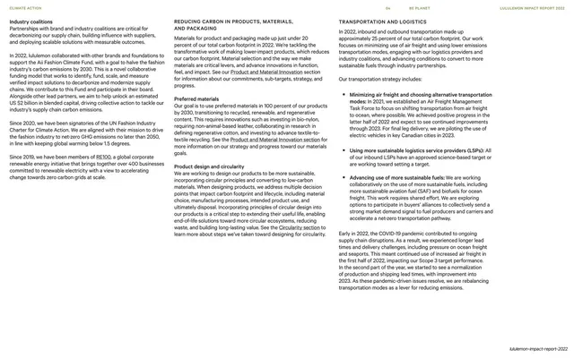
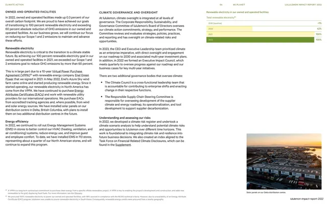
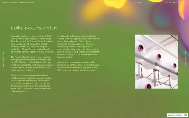
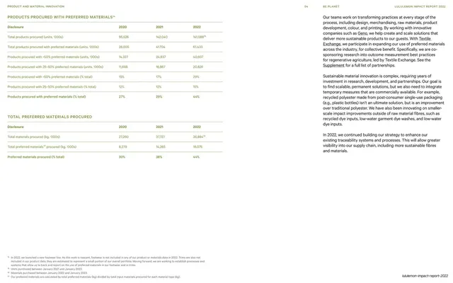
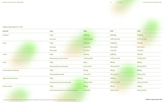
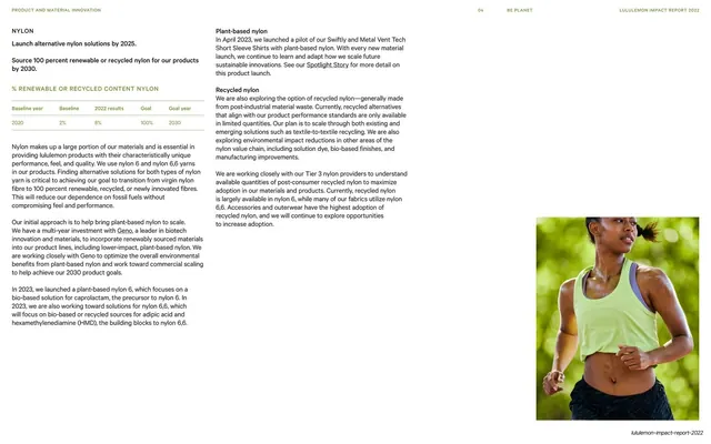
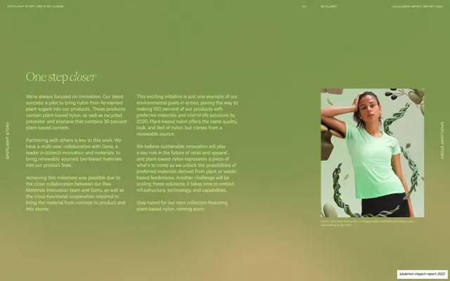
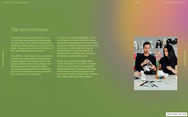
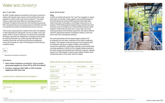
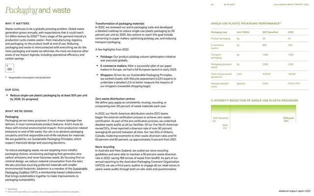
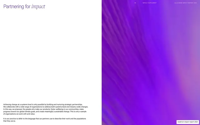
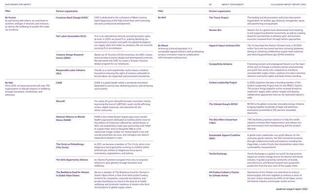
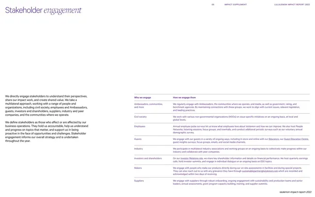
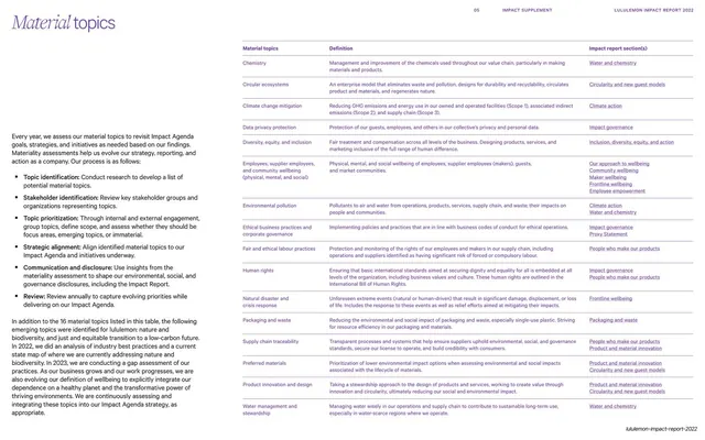
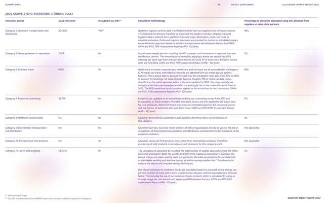
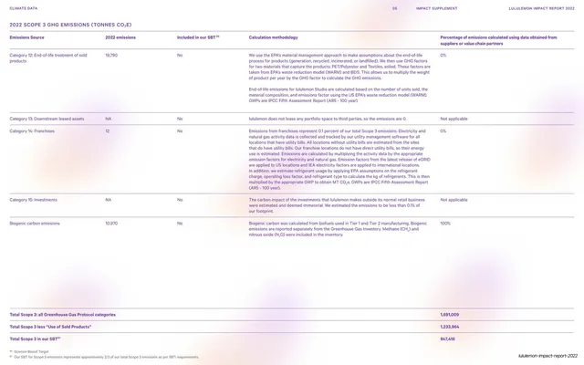
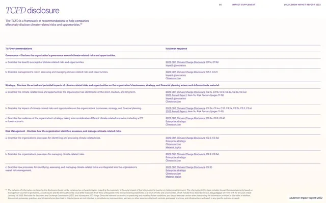
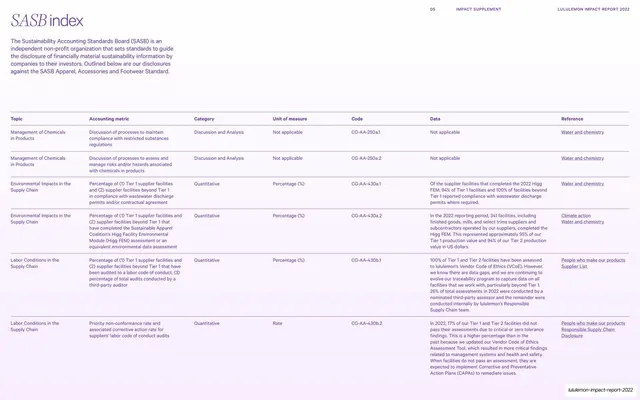
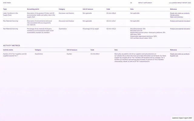
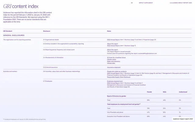
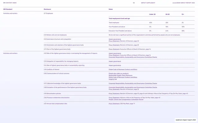
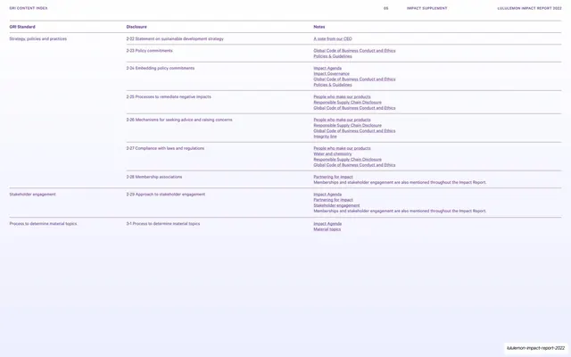
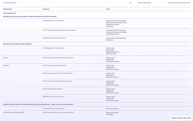
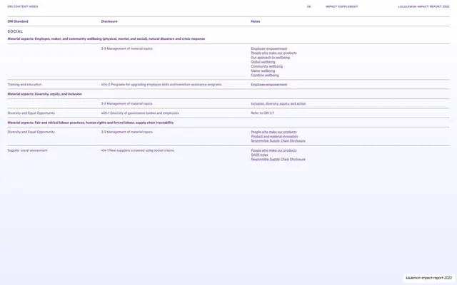
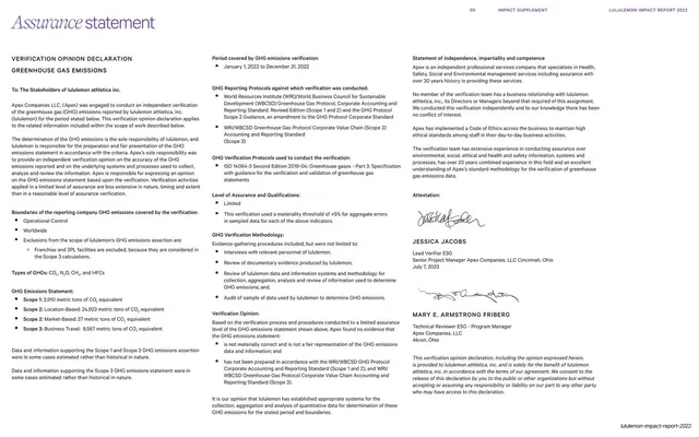
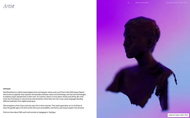
Pages run 16:9. The palette pairs a warm off-white cream ground (#F7F6EE) with dense, soft holographic gradients that blend lime-green, lavender, electric blue, pink, yellow and orange. These gradients appear as full-bleed wash backgrounds (the cover, the "Impact Agenda" opener), as a large three-circle Venn diagram (blue "Be Human", orange "Be Well", green "Be Planet"), and as color-blocked stat panels. The recurring type move is a light roman/sans headline with one or two words swapped into an italic serif: "A note from our CEO", "Who we are", "Enterprise strategy", "16 goals for a healthier future". Body copy is a small, calm sans set in multi-column blocks with generous whitespace. A consistent running header sits at top center-right on every interior page: a section number ("01"), the section name in tracked caps ("INTRODUCTION"), and "LULULEMON IMPACT REPORT 2022" at the right; the lululemon omega logo appears on the cover. Layout grammar is broad: full-bleed athletic photography on split text/image pages (runners, in-store, outdoors), wide multi-column governance and responsibility tables ruled with thin hairlines, large-number stat grids with footnoted figures, a layered "Power of Three" / "Impact Agenda" comparison block, and a dense goals-tracking table with status dots and arrows. Photography is bright, natural-light lifestyle work showing diverse people, product and stores.
Key takeaway
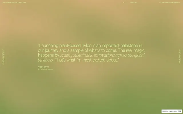
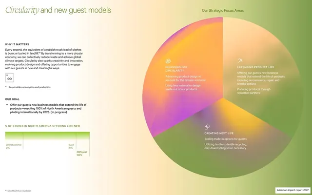
The single strongest idea is the gradient-as-identity: dense, painterly iridescent washes carry every cover and divider while the content stays calm cream, so a 90-plus-page compliance document never reads as dry. Second, the mixed-type signature, one italic serif word inside an otherwise plain headline, gives a consistent, low-cost editorial voice across the whole deck. Third, the Venn diagram rendering the three impact pillars as overlapping translucent color fields is a memorable way to show a strategy framework.
Reuse notes
A strong reference for any long-form annual, impact, ESG or sustainability report, or any corporate document that must hold attention across many data-heavy pages. The gradient system needs a capable production pipeline (large soft-focus renders) and works best with abundant whitespace; crowded onto a busy page it would muddy. The italic-serif-accent headline pattern is directly portable to other reports and editorial decks. Pair the airy data pages with genuinely good lifestyle photography to carry the full-bleed halves; weak imagery would expose the minimalism.
From this deck: Lululemon Impact Report 2022
View deck