Preview image. Unlock full-res
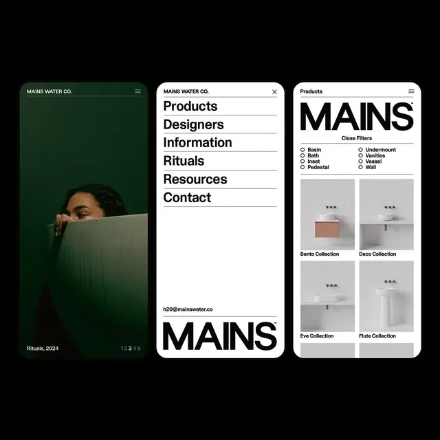
Three stacked mobile screens for bathroom brand MAINS Water Co., pairing a moody green bath photo with crisp white menu and product-filter views under a heavy black wordmark.
Summary
Three rounded-corner mobile screens for bathroom-fixture brand MAINS Water Co., floating on black, where a heavy black "MAINS" wordmark with a tiny trademark glyph anchors a system that swings between dark photographic and clean white product views.
Visual description
The first screen is fully dark, a moody green-toned photo of a person partly submerged behind a bathtub edge, captioned "Rituals, 2024" with a "1 2 3 4 5" pager and a "MAINS WATER CO." header over a hamburger icon. The middle screen is white with an open nav: "Products / Designers / Information / Rituals / Resources / Contact" in large black sans hung on thin rules, footed by an oversized "MAINS" wordmark and a "h20@mainswater.co" address. The third screen is a white products view with the wordmark at top, a "Close Filters" row of radio options (Basin, Bath, Inset, Pedestal, Undermount, Vanities, Vessel, Wall), then a two-up grid of tiled-bathroom product shots labelled Bento, Deco, Eve and Flute Collection.
Key takeaway
The identity flexes between a near-black cinematic mode and a stark editorial-white mode while the same bold "MAINS" wordmark holds it together. Hanging the nav links on hairline rules and setting them oversized turns a plain menu into a typographic statement. The product grid keeps every fixture on the same white-tiled studio set so the catalog reads as one cohesive collection.
Reuse notes
Reach for this when a home-goods, fixtures, or premium e-commerce brand needs an app or site that can run both a hero-photo mood and a utilitarian filterable catalog under one type-led identity. The duotone green photography is what makes the dark screens feel premium; flat product shots alone would not carry it.
More like this



Keep what you find
A free account saves references to boards and can send you a weekly email of picks based on what you save.
To see every result, go Pro.