Preview image. Unlock full-res
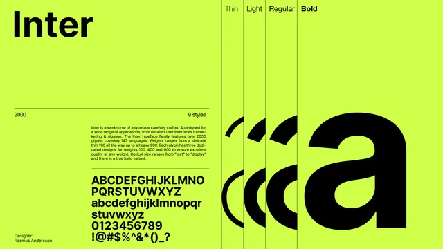
A landscape type-specimen poster for the Inter typeface set black on acid lime, pairing a giant overlapping stack of the letter a across four weights with a left column of metadata and a full glyph set.
Summary
A landscape specimen poster for the Inter typeface, black on acid lime, anchored by four overlapping giant a glyphs (Thin, Light, Regular, Bold) on the right and a tidy metadata column on the left.
Visual description
The poster is built on a strict grid. The headline "Inter" runs oversized top-left. A horizontal rule separates it from a row reading "2000" (glyph count) and "9 styles". Below, a justified paragraph of body copy describes the family, followed by another rule and the full uppercase, lowercase, numeral, and symbol set stacked in bold. Bottom-left credits "Designer: Rasmus Andersson". The right half is divided by thin vertical rules into four columns labeled Thin, Light, Regular, Bold, each holding the same lowercase a at increasing weight so the letterforms overlap and bleed off the bottom edge, dramatizing the weight range in one image.
Key takeaway
Show a typeface's weight axis by overlapping the same glyph at several weights in adjacent ruled columns, letting it run off-canvas at huge scale. Pair the loud display element with a quiet, fully justified Swiss metadata column so the poster is both a showpiece and a real spec sheet.
Reuse notes
A reusable layout for any single-typeface specimen, foundry card, or font-release announcement. The acid lime plus pure black gives maximum contrast and energy; swap the accent to rebrand. Keep the grid rules visible, they do a lot of the structural work.
More like this


Keep what you find
A free account saves references to boards and can send you a weekly email of picks based on what you save.
To see every result, go Pro.