Preview image. Unlock full-res
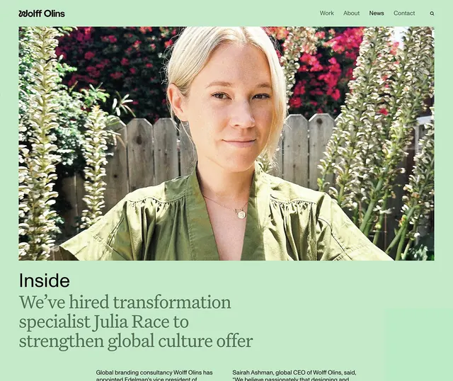
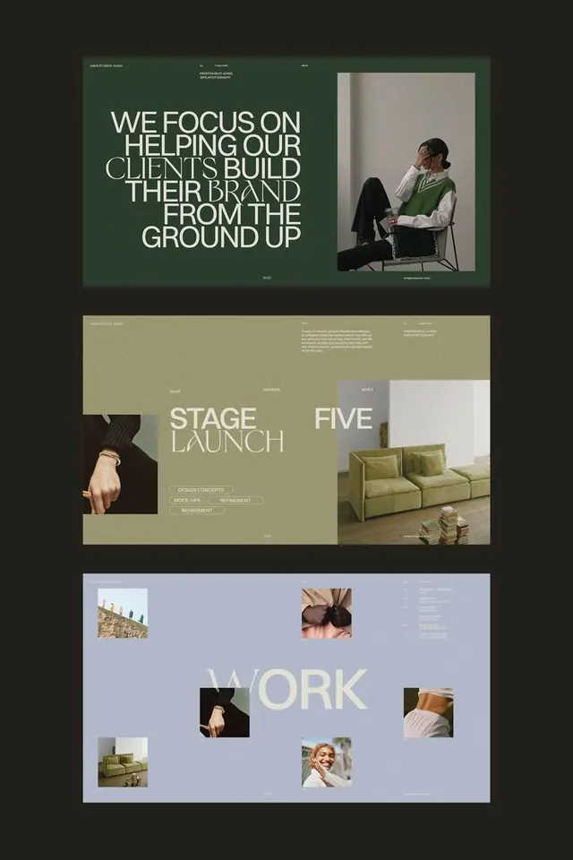
A website news article laid over a pale sage-green field: a full-width sunlit portrait sits above an 'Inside' kicker and a large mixed-weight serif headline, under a navbar.
Summary
A web news-article layout on a flat pale sage-green ground: a full-width sunlit portrait of a person in an olive shirt sits above a small 'Inside' kicker and a large serif headline, with a simple navbar on top and a two-column intro below.
Visual description
The page sits entirely on a soft sage-green field. A left-aligned wordmark sits top left, with 'Work / About / News / Contact' nav links and a search glyph top right, all in small near-black sans-serif. Below, a wide rectangular photograph runs nearly full width: a portrait of a fair-haired person in an olive-green shirt, lit by natural light against a wooden fence and pink-flowering greenery. Under the image, 'Inside' is set as a bold black serif kicker, followed by a three-line headline in a larger serif at lighter weight and olive-toned color, mixing dark and muted green. The bottom edge shows the start of a two-column body in small sans-serif. The green ground, olive shirt, and olive type form a tight tonal palette.
Key takeaway
Tinting the entire page a single soft brand color, then pulling that same hue into the subject's wardrobe and the headline ink, so photo and layout share one palette. Pairing a tiny bold serif kicker against a large light-weight serif headline gives editorial hierarchy without a size jump alone.
Reuse notes
A refined template for a consultancy, agency, or B2B brand's news and press section where warmth matters more than punch. The effect leans on art-directed photography that already matches the brand color, so it needs commissioned or carefully selected imagery. Keep the palette tight; introducing a contrasting accent would break the calm.
More like this





Keep what you find
A free account saves references to boards and can send you a weekly email of picks based on what you save.
To see every result, go Pro.