Preview image. Unlock full-res
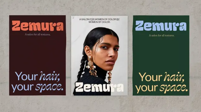
Three-poster identity system for Zemura salon using deep earth tones and gold accents, with central portrait of a woman and layered typographic tagline.
Summary
Triptych poster series for Zemura, a salon for women of color, alternating solid earth-tone backgrounds with a center portrait and repeated tagline in italicized type.
Visual description
Three posters mounted side by side against a neutral background. Left: deep burgundy/maroon background with coral-orange italic "Zemura" logo and light blue/lavender italic copy "Your hair, your space." Center: light gray background featuring a woman's portrait (braided hair, gold statement earrings) with the text "A SALON FOR WOMEN OF COLOR BY WOMEN OF COLOR" above and white sans-serif "Zemura" logo below. Right: deep forest green background with light blue italic "Zemura" and warm yellow-gold italic copy "Your hair, your space." Each poster maintains consistent typography (display sans-serif in italic and caps) but varies background color and text color, creating visual rhythm while anchoring the identity with the center portrait and repeated tagline.
Key takeaway
The three-color background variation (burgundy, cream, forest-green) creates visual interest without changing the core message. Italicizing the tagline gives it personality and softness. Centering the portrait and mission statement communicates brand values visually. The color scheme respects warm earth tones and avoids cliched beauty-industry pastels.
Reuse notes
Appropriate for wellness, beauty, or community-focused services targeting underrepresented audiences. The triptych format works for physical spaces (storefronts, waiting areas) and scaled versions suit digital marketing. The portrait adds humanization; ensure high-quality photography if using this approach. The deep, warm palette requires good lighting to read well in print.
More like this




Keep what you find
A free account saves references to boards and can send you a weekly email of picks based on what you save.
To see every result, go Pro.