Preview image. Unlock full-res
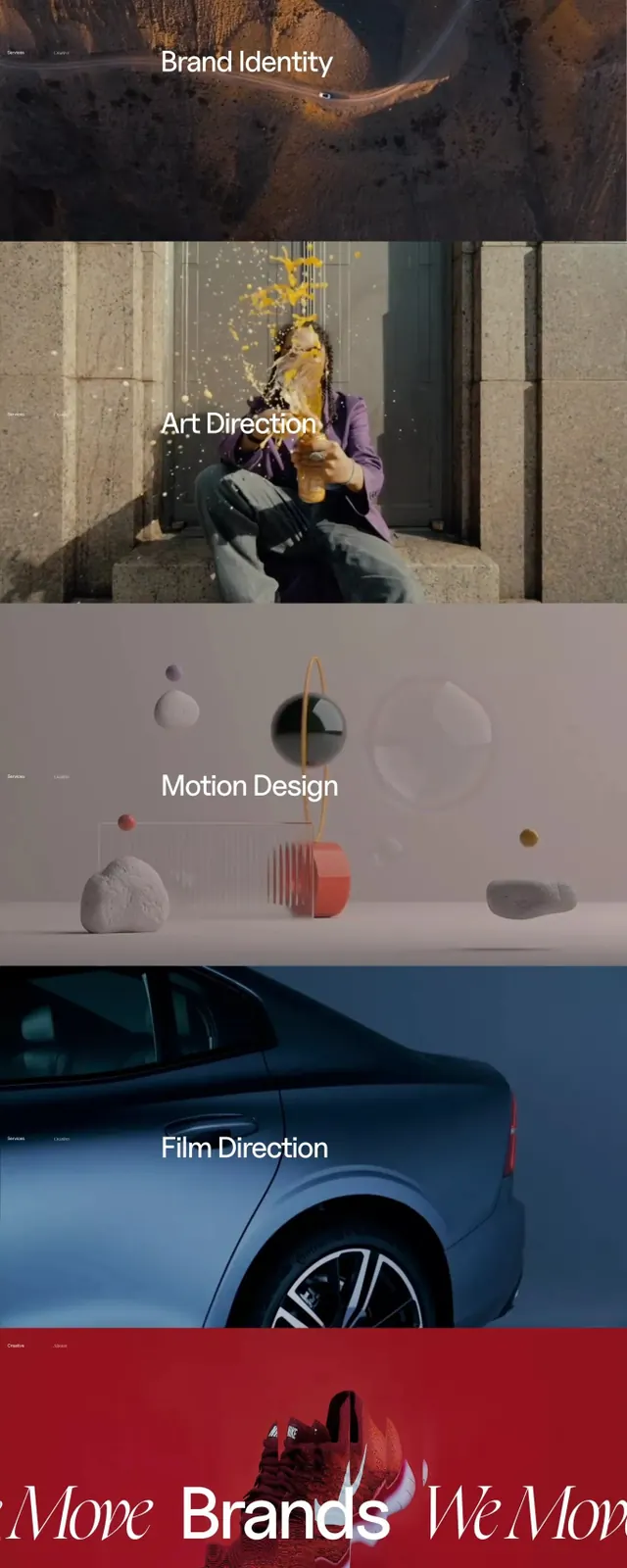
Portfolio agency brand system presented across seven vertically stacked sections, each showcasing a different service (Brand Identity, Art Direction, Motion Design, Film Direction) via thematic photography and typography.
Summary
A full-page portfolio brand guide for Move Folio that sequences seven service categories (Intro, Brand Identity, Art Direction, Motion Design, Film Direction, Brands section, Footer) as vertical sections, each with bold typography, thematic photography, and a consistent color language anchored in deep maroon and cool blue tones.
Visual description
A tall scrolling layout composed entirely of horizontally stacked image and text blocks. The top section features the title "Move" in large sans-serif and "Folio" in an elegant italic, with a duotone hand image (cyan and magenta/red gel). Below, seven distinct sections, each with a centered section label (white sans-serif, 16-20px), followed by full-bleed or edge-to-edge photography: a close-up clay or ceramic texture, a seated figure in vibrant purple clothing against an institutional wall, abstract soft objects (spheres and geometric forms in muted pastels), a partial car detail in cool cyan-blue tones, a woman's legs and red shoes/product on deep maroon background, and a client list in caps. Footer contains the brand mark (a small red square) centered at bottom. Palette throughout cycles between maroon/deep red, cool blue-cyan, cream white, dark charcoal, and muted earth tones. Typography is spare: one or two lines per section in bold display sans-serif.
Key takeaway
The vertical sectioning technique that gives each service equal visual weight while allowing distinct photography to define its character; the disciplined use of two complementary color accents (maroon and cyan) as tonal overlays on photography to unify disparate imagery; and the restraint of minimal copy and maximum breathing room to signal confidence and premium positioning.
Reuse notes
Excellent model for multi-service creative agencies, studios, and portfolio sites where showcasing different disciplines matters. Works best when you have strong, diverse photography that can carry the visual weight; the layout relies on image quality, not decoration. The duotone approach is particularly effective for heterogeneous content (product, space, people, abstract). Pair with generous leading and ample white space. The maroon/teal palette is not load-bearing, but the principle of choosing two accent colors and applying them consistently is.
More like this


Keep what you find
A free account saves references to boards and can send you a weekly email of picks based on what you save.
To see every result, go Pro.