Preview image. Unlock full-res
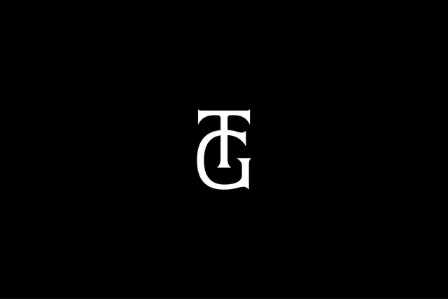
A white serif TG monogram with the T and G stacked into a single locked-up glyph, centered on a pure black field.
Summary
A white serif TG monogram interlocked into one stacked glyph, set dead-center on a pure black background. The single move that defines it is the shared vertical: the stem of the T doubles as the spine that the G nests against.
Visual description
The mark sits small in the middle of a large black frame, with vast empty margins on every side. Both letters are high-contrast serif forms with bracketed serifs and a clear thick-thin stroke modulation, reading like a classical display roman. The T caps the composition and its descending stem runs into the bowl of the G below it, so the two characters share structure rather than sitting side by side. No wordmark, tagline, or supporting text appears.
Key takeaway
The vertical lockup: stacking two initials so they share a single stem turns a two-letter monogram into one compact icon that still scales to a favicon. The serif construction also signals heritage and luxury where a sans monogram would read generic.
Reuse notes
Reach for this when an initials-based mark needs to feel established and high-end, fashion, hospitality, a personal or studio brand. The deep margin of black is part of the effect, so pair it with restrained, spacious layouts. On light backgrounds you would invert to a black glyph; the serif detailing needs enough size to survive, so avoid tiny placements.