Preview image. Unlock full-res
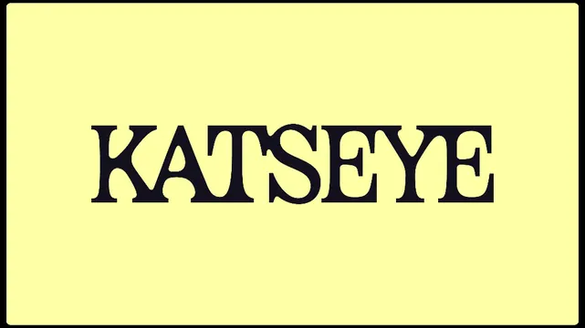
KatSeye wordmark rendered in a heavy display serif typeface centered on a soft pale yellow background, demonstrating classic typographic contrast.
Summary
KatSeye wordmark rendered in a heavy display serif typeface centered on a soft pale yellow background, demonstrating classic typographic contrast.
Visual description
A luminous pale yellow field (roughly #FFFFA5) occupies the frame, with a rounded-corner rectangular border in dark navy/black. Centered is the word "KATSEYE" in a substantial serif display typeface, likely a custom or classic revival face with high stroke contrast. The serifs are broad and bracketed, the characters feel substantial and weighty, with generous letter-spacing. The word is rendered in solid black, creating stark color opposition against the warm yellow ground. The composition is perfectly centered and balanced, with equal breathing room on all sides. The overall mood is of a luxury goods label or editorial publication's title treatment.
Key takeaway
The color pairing of pale yellow and pure black creates sophistication without saturation, suitable for premium positioning. The heavy serif's generous spacing prevents crowding and reads as high-confidence and editorial rather than ornamental. The centered composition and symmetry signal tradition and stability.
Reuse notes
Strong for luxury, fashion, or editorial brands. The serif typeface works well in layouts paired with sans-serif body copy. The yellow-black combination reads warm but not playful, especially effective for heritage or mature brands. Best used at display sizes (headlines, covers, logo applications). Avoid on small screens unless you can ensure the serif's details remain sharp. Works well with high-end photography or minimal photography-free layouts.
More like this




Keep what you find
A free account saves references to boards and can send you a weekly email of picks based on what you save.
To see every result, go Pro.