Preview image. Unlock full-res
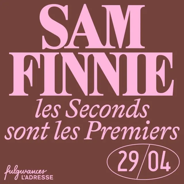
An event poster setting a huge pink display-serif SAM FINNIE name against a warm brown ground, with an italic French subtitle and a 29/04 date in an oval badge.
Summary
A square event poster built almost entirely from type: an oversized pink high-contrast display serif spelling SAM FINNIE across two lines on a warm brown ground, defined by the tight two-color pink-on-brown duotone.
Visual description
The whole field is a muted reddish-brown. SAM and FINNIE are set in light pink, in a tall high-contrast didone-style serif with sharp thin-to-thick stress, filling the upper two-thirds at full bleed width. Below, in a contrasting pink italic serif, sits the French line les Seconds sont les Premiers across two lines. Lower right, the date 29/04 sits inside a thin pink oval outline. Bottom-left a small logo lockup reads fulgurances / L'ADRESSE. Everything is one pink ink on one brown, so contrast comes from type weight, scale and style rather than color.
Key takeaway
Carrying an entire poster on a single tight duotone and three type voices: a massive didone name, a flowing italic subhead, and a date dropped into a hand-drawn oval badge. The oval-outline date stamp is a cheap, charming way to mark an event without a separate graphic. Mixing a rigid high-contrast serif with a looser italic gives hierarchy without a second color.
Reuse notes
Ideal for restaurant residencies, gigs, talks, and pop-up event announcements where a name and date are the whole message. The didone-plus-italic pairing reads premium and editorial. Swap the brown/pink duotone per event to build a recognizable series; needs a genuinely high-contrast serif to land.
More like this

Keep what you find
A free account saves references to boards and can send you a weekly email of picks based on what you save.
To see every result, go Pro.