Preview image. Unlock full-res
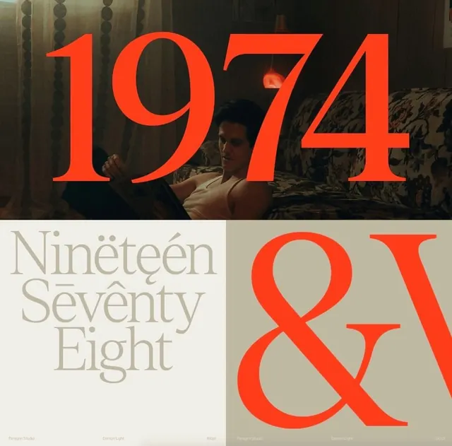
A type-specimen layout pairing a giant orange serif '1974' bleeding over a warm 1970s interior photo with a cream block spelling 'Nineteen Seventy Eight' in the same Denton serif.
Summary
A serif type specimen that overprints a huge orange "1974" across a moody 1970s film still, then drops to a cream panel spelling "Nineteen Seventy Eight" stacked in a high-contrast Didone-style serif. The defining move is the bright orange display type sitting on top of a soft, low-light photo so the lettering reads as both headline and texture.
Visual description
The top half is a warm, dimly lit interior photograph: a young man in a tank top reclines reading on a floral-patterned sofa, a glowing red lamp behind him, sheer curtains at left. The numerals "1974" run across it in saturated orange, the strokes large enough to bleed off both edges. The lower half splits into two cells: a cream panel at left stacking "Nineteen Seventy Eight" in three centered lines of a contrasted serif, with diacritical accents peppered over the letters as a glyph showcase; and a darker olive panel at right holding a giant orange ampersand and a clipped "W". A thin specimen footer runs along the bottom listing the studio credit, the typeface name "Denton Light", and point sizes.
Key takeaway
Overprint oversized display type directly onto a photograph in a single loud accent color so the type and image fuse instead of stacking. The specimen footer (foundry, font name, point size) and the scattered accent marks turn a mood image into a credible type-showcase format.
Reuse notes
Reach for this when presenting an editorial or fashion serif and you want warmth, not a sterile white card. The 70s film-still palette of olive, brown, cream, and a single orange accent does a lot of the work; swap the photo and accent hue to retheme. Caveat: orange type over a busy photo needs the photo kept dark and low-contrast or the numerals lose legibility.
More like this







Keep what you find
A free account saves references to boards and can send you a weekly email of picks based on what you save.
To see every result, go Pro.