Preview image. Unlock full-res
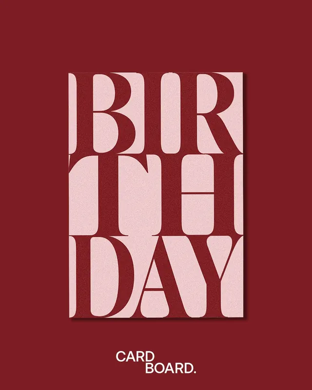
Poster with 'BIRTHDAY CARDBOARD' spelled in large maroon and dusty-pink serif letterforms arranged in a grid, creating a high-contrast color-blocking composition.
Summary
Poster with "BIRTHDAY CARDBOARD" spelled in large, blocky serif letterforms arranged in a 3x2 grid, with letters alternating between deep maroon and dusty pink on a maroon background.
Visual description
Full-bleed maroon background (#7D1C23) with large display serif letters arranged in a 3x2 grid filling the center. Letters are rendered in alternating color blocks: dusty pink (#EDC9CB) and maroon, creating a two-tone checkerboard rhythm. The serif typeface is thick, geometric, with generous counters and high-contrast strokes. Letterforms are tightly spaced horizontally and vertically, creating a unified block composition. Below the grid, in small white sans-serif, sits "CARD / BOARD." as a secondary line. The overall effect is stark, intentional, and playful despite the classical serif treatment.
Key takeaway
The serif typeface rendered as a system of color-blocked units, where individual letters become abstract shapes. The maroon-and-pink palette creates a retro warmth that feels both sophisticated and nostalgic. The grid structure imposes order on the composition while the color alternation adds visual rhythm.
Reuse notes
Strong fit for stationery design, greeting cards, and vintage-leaning packaging. The color combination works particularly well for brands targeting luxury lifestyle, heritage retail, or emotional/nostalgia-driven categories. The letter-as-shape idea translates to poster series where each word or phrase could follow the same grid system. Caution: serif grids like this read as playful rather than serious, so avoid for legal, financial, or ultra-formal contexts.
More like this


Keep what you find
A free account saves references to boards and can send you a weekly email of picks based on what you save.
To see every result, go Pro.