Preview image. Unlock full-res
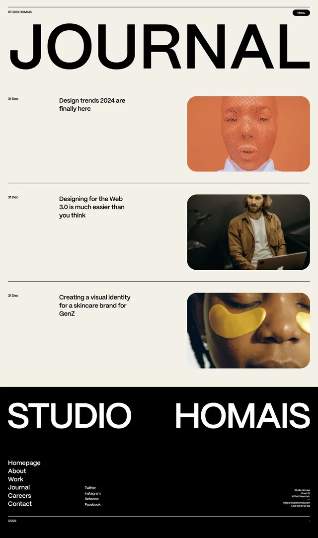
A minimalist design studio website homepage displaying a bold JOURNAL section with three article previews, each pairing a headline and date with a rounded-corner image thumbnail.
Summary
A design studio website with a bold JOURNAL section showcasing three article cards, each combining a dated headline, descriptive text, and a rounded-corner photograph, anchored by a black footer containing studio branding and navigation.
Visual description
Vertical scrolling layout on an off-white background. At the top, "STUDIO HOMAIS" in small sans-serif, "Menu" button in top-right corner. A large, heavy sans-serif headline reading "JOURNAL" occupies the upper third. Below are three stacked article cards, each with a date on the left ("31 Dec"), a two-line headline and single descriptive sentence in clean sans-serif centered, and a rounded-rectangle image on the right showing: a mesh-filtered portrait in warm terracotta, a person at a desk in cooler tones, and a close-up face with yellow-filtered light. A thin horizontal line separates each card. At the bottom, a black footer bar contains the studio name "STUDIO HOMAIS" split across two columns, with navigation links (Homepage, About, Work, Journal, Careers, Contact) on the left and social / contact info on the right.
Key takeaway
The article-card layout uses minimal components (date, headline, description, image) but gains visual rhythm through consistent proportions and negative space. Rounding the image corners softens the brutalist grid while keeping it modern. The black footer provides visual anchor and branding presence without overwhelming the content above. The geometric sans-serif for headlines stands confident next to smaller sans-serif for body, creating clear hierarchy.
Reuse notes
Ideal foundation for creative studios, design agencies, and portfolio sites targeting sophisticated visual audiences. The warm terracotta accent color punches through the neutral palette without saturation. The grid scales well from tablet to desktop; mobile responsiveness would stack images above text. The three-card limit avoids cognitive overload; use pagination or "view more" below for longer archives. The style reads premium and self-assured, suited to mid-to-high-budget creative positioning.
More like this



Keep what you find
A free account saves references to boards and can send you a weekly email of picks based on what you save.
To see every result, go Pro.