Preview image. Unlock full-res
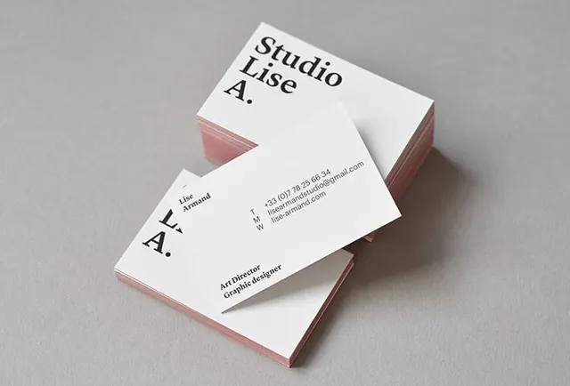
A stack of minimalist white business cards with bold black typography and soft pink edges is arranged on a gray surface.
Summary
A stack of minimalist white business cards with bold black typography and soft pink edges is arranged on a gray surface.
Visual description
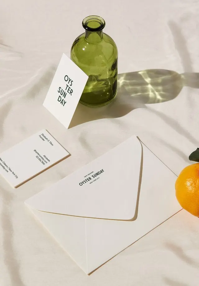
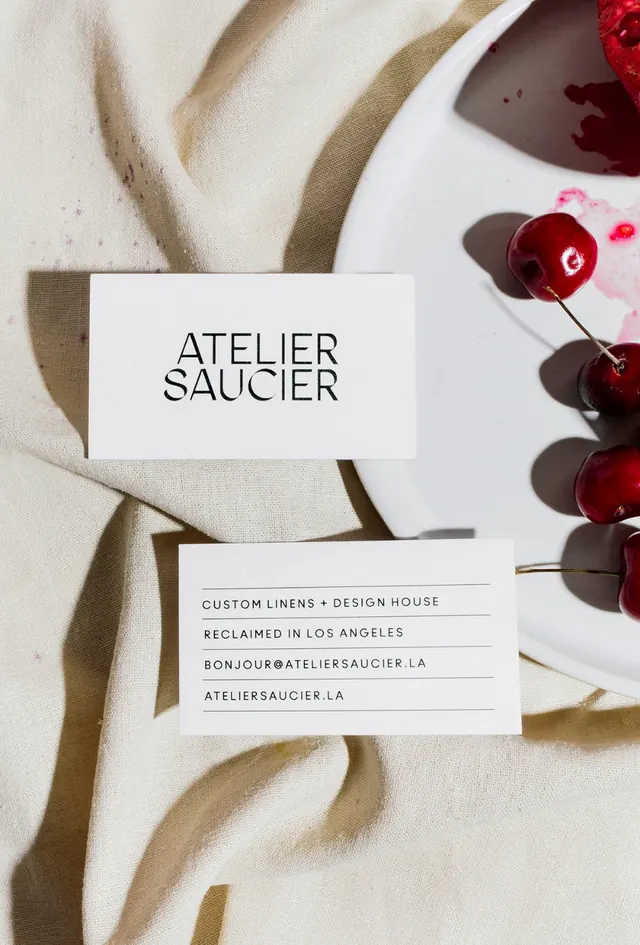
Two white business cards are photographed on a neutral gray background, one laid diagonally across a stacked set of cards. The cards use large black serif lettering, small contact text, and subtle pink-toned edges that show through the layered stack.
Key takeaway
Use oversized serif branding with lots of negative space on a restrained white card. Add a subtle colored edge or layered paper stock detail to make a minimal identity feel more tactile and premium.
Reuse notes
Best for identity presentations, studio branding, and stationery mockups where the typography should feel refined and sparse. It works when the goal is to make print collateral look elegant without adding extra graphics.