Preview image. Unlock full-res
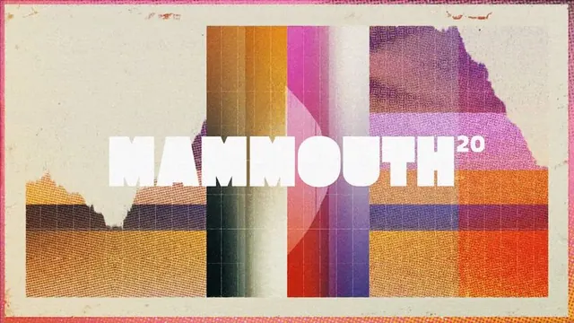
Wide retro banner reading MAMMOUTH in chunky white condensed caps, knocked out over vertical stripes of sun-faded halftone color on a cream paper ground.
Summary
A landscape title card spelling MAMMOUTH in heavy white condensed capitals, set across a band of vertical color stripes textured like faded screen-printed halftone, with a small superscript "20".
Visual description
The center of the composition is a horizontal rectangle filled with tall vertical bands of color, terracotta orange, hot pink, olive, teal, and dusty mauve, each rendered with a coarse dotted halftone grain so they look sun-bleached and risograph-printed. A faint grid of fine lines overlays the bands. The wordmark MAMMOUTH runs across the middle in a bold, tightly spaced condensed sans, knocked out in clean white so it punches through the busy striped field, with a tiny "20" set as superscript at the end. The colored panel does not reach the edges: torn, ragged halftone fringes bleed outward into a cream paper ground, and the whole thing is bordered top and bottom by thin warm-pink rule lines, framing it like a worn ticket or sleeve.
Key takeaway
Pair maximal, noisy texture with one ultra-clean typographic element: the crisp white condensed wordmark stays legible precisely because everything behind it is chaotic. The ragged halftone edges bleeding into bare paper sell a printed, tactile artifact far better than a hard rectangular crop.
Reuse notes
A strong template for event titles, festival lockups, music or zine covers, and merch where you want vintage warmth without going full skeuomorphic. Works when you have a short, punchy word to carry the center. Caveat: the halftone grain needs real resolution to read as texture and not as compression mush at small sizes.
More like this

Keep what you find
A free account saves references to boards and can send you a weekly email of picks based on what you save.
To see every result, go Pro.