Preview image. Unlock full-res
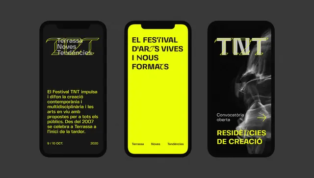
Three phone screens for a Catalan-language arts festival, alternating charcoal and acid-yellow backgrounds with chunky display headlines and a stencil-cut TNT wordmark.
Summary
Mobile-first identity for a Catalan-language arts festival, built on a two-color system of charcoal and electric acid yellow with oversized condensed headlines. A stencil-cut TNT wordmark anchors the brand.
Visual description
Three vertical phone screens sit side by side on a dark backdrop. The left screen is charcoal grey with a small yellow logo lockup at top and a block of running Catalan copy set in yellow. The center screen flips the system: a solid acid-yellow field carrying a black, tightly stacked all-caps headline that fills the frame edge to edge. The right screen returns to near-black, dominated by an oversized stencil-style "TNT" wordmark with cut gaps in the letterforms, plus a smaller yellow subhead beneath. Type is heavy, condensed, and left-aligned throughout, with generous letter-stacking that turns headlines into solid graphic blocks.
Key takeaway
The strict two-color charcoal-and-acid-yellow swap: backgrounds and type trade places screen to screen, so the brand stays recognizable while every view looks fresh. The stenciled cuts in the TNT wordmark double as a literal nod to the name and a reusable texture motif.
Reuse notes
Strong template for an event, festival, or culture brand that lives mostly on phones and social. The acid yellow needs the charcoal to stay legible, so keep it as a duotone rather than adding more hues. Pairs well with a condensed grotesque and tightly leaded headline stacks.
More like this




Keep what you find
A free account saves references to boards and can send you a weekly email of picks based on what you save.
To see every result, go Pro.