Preview image. Unlock full-res
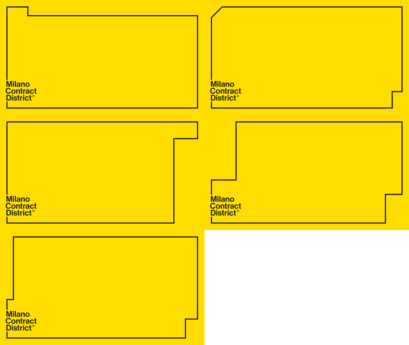
A Milano Contract District brand layout setting a bold black sans-serif lockup in the lower-left corner of a notched outline frame on a saturated yellow field.
Summary
A Milano Contract District brand layout on a flat yellow field, framed by a thin black outline with a small rectangular notch cut into its top-left corner. The brand name is set as a three-line black grotesque lockup in the bottom-left, with a registered-trademark symbol.
Visual description
The whole canvas is saturated yellow. A single-weight black rectangular border runs just inside the edges; at the top-left the border steps down and back up to form a small square notch, like a folder tab or a die-cut. The lower-left corner holds a tight wordmark, "Milano / Contract / District", stacked on three lines in a heavy, slightly condensed sans-serif, lowercase except for each word's initial cap, with a small circled R set as a superscript after "District". The vast yellow interior is left empty, so the layout reads as a reusable brand template or cover rather than a finished composition.
Key takeaway
The notched outline frame: a plain rectangular border with one small subtraction becomes a recognizable container device you can repeat across covers, posters, and documents. Pairing a single loud brand color with a corner-anchored type lockup and a huge empty middle gives you a flexible system shell where artwork or copy can drop into the void.
Reuse notes
Good for a confident, design-forward agency, real-estate, or contract/construction brand that wants one ownable color plus a structural frame. The empty center is the point: it is built to host changing content. Caveat: the look leans entirely on the yellow and the frame device, so on a white or photographic background it loses most of its identity.
More like this






Keep what you find
A free account saves references to boards and can send you a weekly email of picks based on what you save.
To see every result, go Pro.