Preview image. Unlock full-res
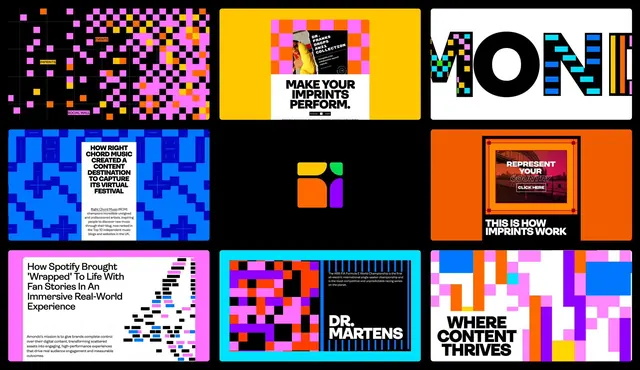
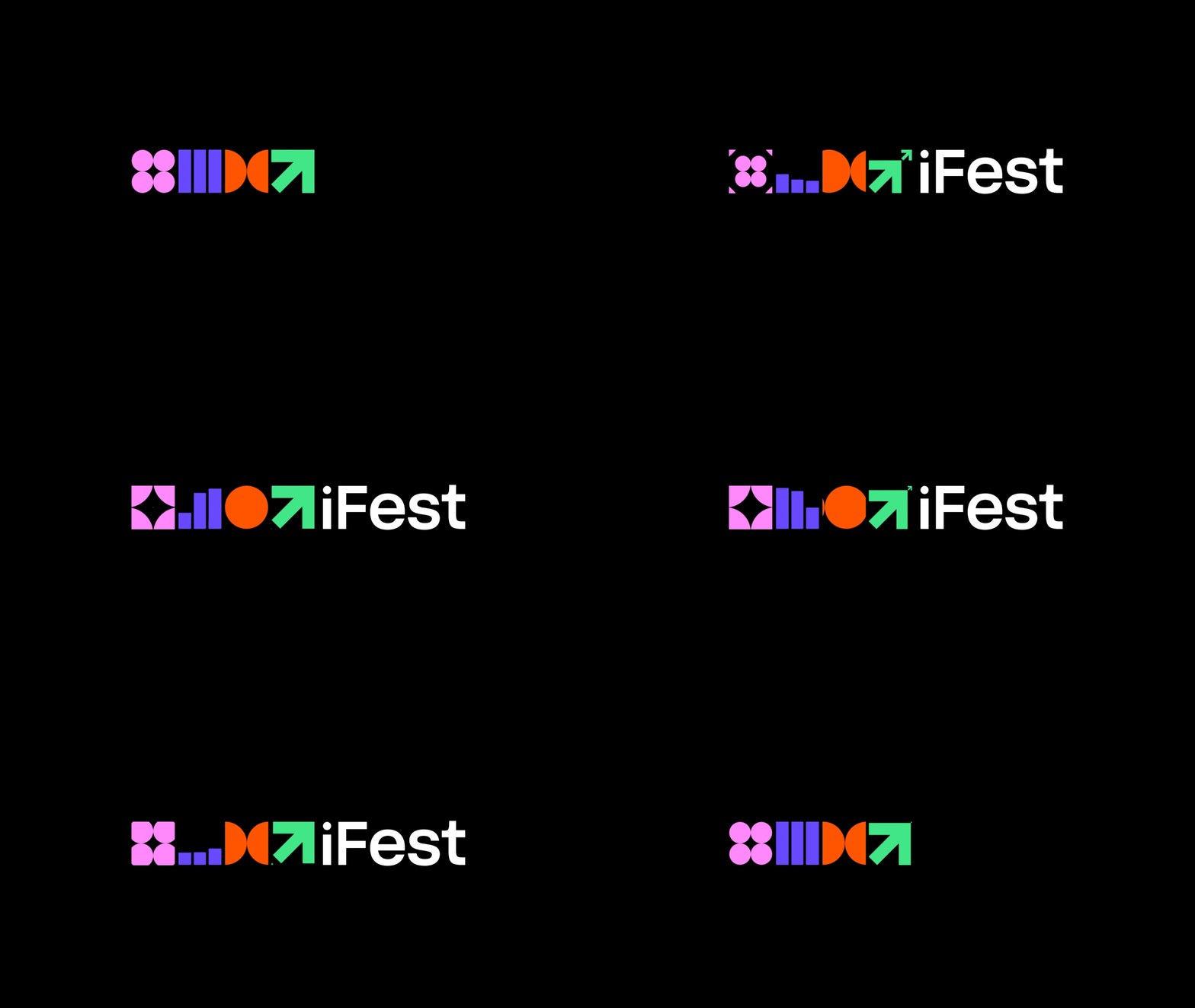
A playful tech logo built from five distinct geometric modules: a pink dot-grid, purple vertical bars, orange bowtie, and bright-green arrow, arranged horizontally on black.
Summary
A playful modular mark where five colored geometric shapes (pink dots, purple bars, orange bowtie, green arrow) stand horizontally as both a logo and an icon system, centered small on black.
Visual description
The mark sits dead-center on a pure black frame, occupying minimal width so negative space dominates. Reading left to right: four pink circles arranged in a 2x2 grid, three tall purple vertical bars (the blue-purple of a tech logo), an orange hourglass or bowtie (two semicircles mirrored), and a bright lime-green arrow pointing up and to the right. Each module is flat, fully saturated, and reads as a distinct shape. Together they suggest abstracted letterforms or syllables spelling out a whole. The composition is perfectly symmetrical top-to-bottom and uses primary colors at high chroma.
Key takeaway
A logo system where each module is self-contained and independently usable as an icon, yet reads as a cohesive mark when arranged. The neon-bright colors against deep black maximize contrast and energy. The trailing arrow adds a growth or forward-motion implication without needing a word or explainer.
Reuse notes
Ideal for tech, media, or startup identities wanting modularity without sacrificing boldness. The tiny-on-black presentation reads premium and gives each color maximum visibility. Works as an animated loading sequence or a system of interchangeable icons. Pair with generous whitespace; the shape-modules pair well with minimal wordmarks or without words altogether.