Preview image. Unlock full-res
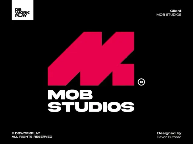
Logo system pairing a large hot-pink geometric arrow mark with bold white sans-serif wordmark on black background.
Summary
A bold brand identity pairing a hot-pink geometric arrow as the primary mark with stacked "MOB STUDIOS" wordmark in white all-caps sans-serif, set against black with supporting client and credit lines.
Visual description
The mark is a large, single-stroke hot-pink geometric shape resembling a rightward arrow or lightning bolt, rendered with clean angular edges and 3D depth. Below sits "MOB STUDIOS" in a heavy, geometric sans-serif rendered in white, stacked in two lines. Supporting elements include "DB WORKPLAY" logo in the top-left corner (white square with black condensed type), "Client: MOB STUDIOS" in white text at top-right, and attribution lines for copyright and designer (Davor Butorac) at the bottom. The black background creates maximum contrast with the neon pink mark and white typography.
Key takeaway
The geometric arrow mark is distinctive and immediately readable at any scale. The bold weight and geometric construction of the wordmark creates kinetic energy that matches the mark without competing. The stacked layout with supporting information creates a complete brand presentation while maintaining visual hierarchy.
Reuse notes
Ideal for creative studios, tech companies, or brands seeking a bold, youthful identity. The hot-pink + black combination is memorable and works across digital and print applications. Best used where the mark can be prominent; the stacked wordmark is less suited to tight corners or very small formats.