Preview image. Unlock full-res
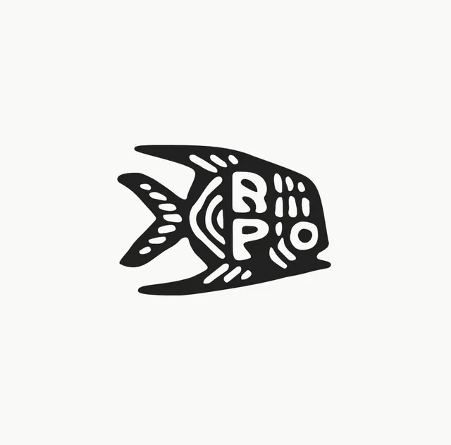
A solid-black fish logomark with the letters R, P and O hidden in its body, detailed with hand-drawn white negative-space scales, fins and gill marks.
Summary
A single black fish silhouette that doubles as a wordmark: the letters R, P and O are carved out of its body in white, surrounded by hand-drawn scale and fin detailing.
Visual description
One compact angelfish-shaped silhouette in near-black sits centered on a warm off-white field. The form is a solid mass with a forked tail, a tall dorsal fin and a swept lower fin. Inside the body, rough hand-drawn white lines pick out the eye, a curved gill bracket, rows of dashed scales and a striped flank. Worked into that detailing are three rounded letters reading R, P and O, stacked and tucked so they read both as type and as part of the fish's anatomy. The line quality is loose and organic rather than vector-precise.
Key takeaway
Burying a three-letter monogram inside an animal silhouette so the mark works as both picture and wordmark in one glance. The hand-drawn white marks give a flat black shape texture and personality without adding a second color.
Reuse notes
A natural fit for a seafood brand, fishing or marine-conservation outfit, or any RPO-initialed venture wanting a warm, crafted mark. It stays legible as a one-color stamp; reverse it to white-on-dark for packaging or merch.
More like this









Keep what you find
A free account saves references to boards and can send you a weekly email of picks based on what you save.
To see every result, go Pro.