Preview image. Unlock full-res
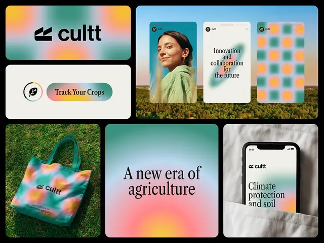
A cohesive six-panel brand identity for an agricultural-tech company, blending minimalist logo treatment with earthy tones, app UI screens, and lifestyle photography.
Summary
A brand identity system for Cultt, an agricultural-tech company, spanning logo, badge, app screens, product photography, and lifestyle imagery in warm earth tones and teal accents.
Visual description
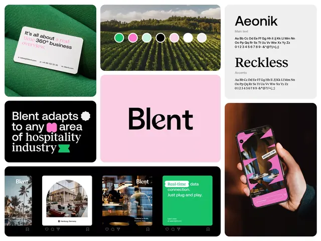
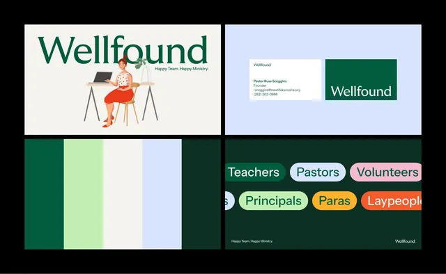
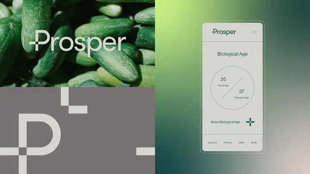
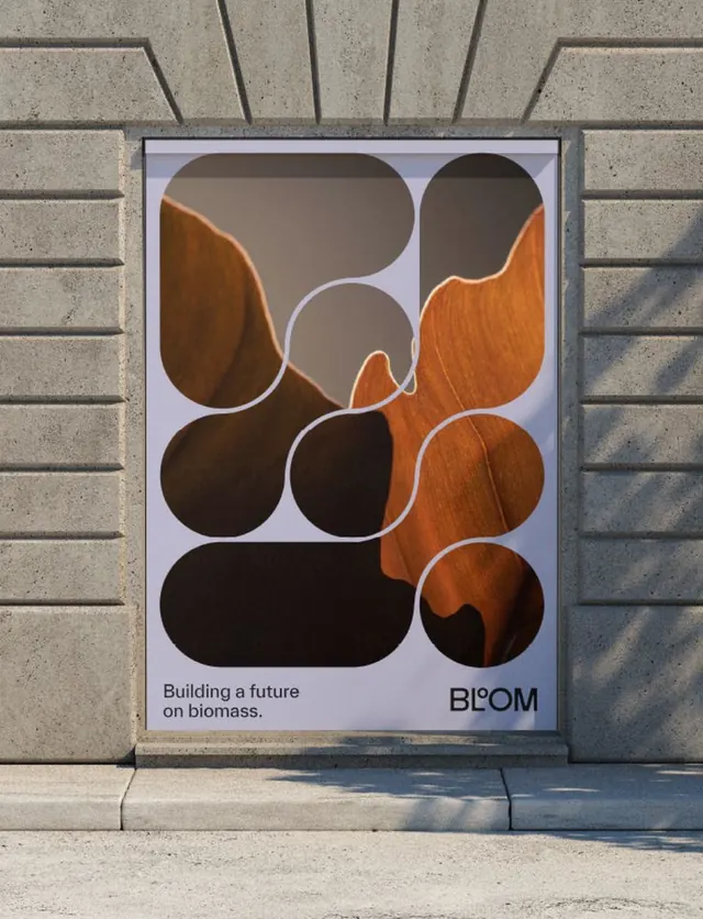
Six rectangular panels arranged in a 3x2 grid. Top-left: a wordmark logo "cultt" in sans-serif with a small icon badge marked "Pace Your Growth" in teal and coral. Top-center: a product screenshot showing UI elements with orange accents on a light background. Top-right: a geometric pattern of teal and orange circles on white. Bottom-left: lifestyle photograph of hands interacting with plants, shot through a warm gradient overlay (coral to teal). Bottom-center: a typographic treatment reading "A new era of agriculture" in serif type on a soft gradient background (coral through peach). Bottom-right: a clean mockup of an app interface on a mobile device with light background and coral details.
Key takeaway
The restricted four-color palette (black, coral/orange, teal, off-white) applied consistently across six different brand applications (logo, UI, pattern, photography, headline, device). The pairing of warm and cool tones creates visual harmony while maintaining contrast. The mix of geometric pattern, lifestyle imagery, and clean UI screens gives depth to a minimalist approach.
Reuse notes
Strong template for early-stage brand identity systems, particularly for sustainable, agricultural, or B2B tech verticals. The layering of photo with gradient overlay (bottom-left) is a practical technique for unifying disparate imagery. The geometric pattern (top-right) breaks up text-heavy layouts. Works well when presenting brand guidelines alongside product mockups.