Preview image. Unlock full-res
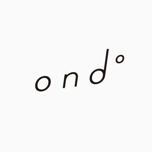
A minimal lowercase wordmark reading 'ond' with a superscript circle, hand-drawn in a thin monoline script and set on a tilted baseline against plain white.
Summary
A lowercase hand-drawn wordmark reading "ond" with a small raised circle after it, rendered in a thin even-weight monoline and tilted upward across the frame on a pure white field.
Visual description
Three soft lowercase letters, o, n, d, are drawn freehand with a consistent thin stroke and rounded, slightly imperfect terminals, then trailed by a small superscript open circle that lifts the eye off the end of the word. The whole mark sits on an upward diagonal baseline rather than level, giving it a casual, rising motion. There is no other text or framing; the logotype floats alone, centered, in generous white space with no color beyond near-black ink on off-white.
Key takeaway
The tilted baseline plus the floating superscript circle: two tiny moves that turn an otherwise plain lowercase word into a mark with personality and direction. The even monoline weight keeps it legible while reading as hand-made rather than typeset.
Reuse notes
Good for a boutique, wellness, studio, or consumer brand wanting warmth without looking childish. The hand-drawn line scales down cleanly to favicon size. Caveat: the freehand stroke and diagonal set make it harder to lock into a rigid grid system, so plan the surrounding layout around its informality.