Preview image. Unlock full-res
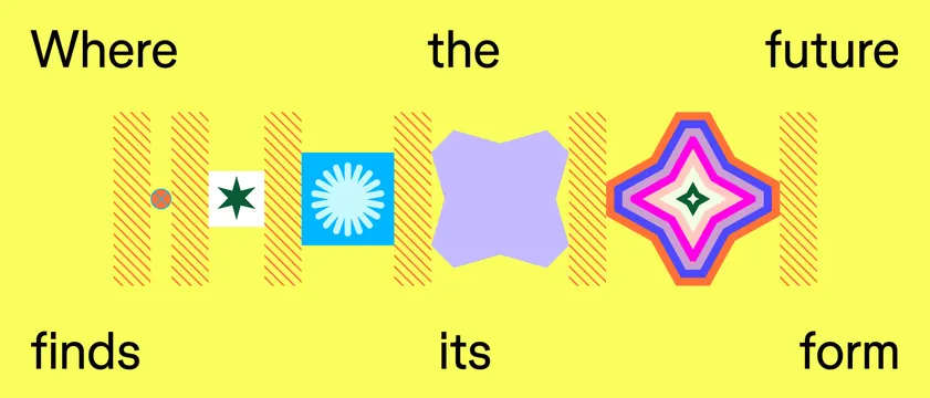
Bright yellow horizontal banner spelling 'Where the future finds its form' around a centered row of five abstract icons, including a starburst, a blobby field, and a layered diamond.
Summary
A vivid yellow banner that frames a centered lineup of five small abstract brand marks with the words "Where the future finds its form" set in black caps across the top and bottom edges.
Visual description
On a near-fluorescent yellow field, the tagline runs as two split lines: "Where / the / future" pinned to the top corners and center, and "finds / its / form" mirrored along the bottom, all in a clean black sans-serif. Between them sits a horizontal row of icons separated by orange diagonal-hatch dividers: a brown dot, a green eight-point star on a cream square, a white sunburst on a cyan tile, a soft lavender blob, and a concentric layered diamond cycling through pink, orange, yellow, and green. The marks read as a sampler of one brand's visual vocabulary rather than a single logo.
Key takeaway
The "icon sampler" device: lining up several candidate or sub-brand marks in one strip, divided by a repeating hatch motif, to show a whole shape language at a glance. The split tagline anchored to the four edges turns the icon row into the visual center without a box.
Reuse notes
Good for a brand-elements slide, a creative-studio header, or an education or kids-product identity that wants optimism over polish. The hatched dividers tie disparate shapes together. The acidic yellow is loud, so reserve it for accent moments rather than full-page backgrounds with body copy.