Preview image. Unlock full-res
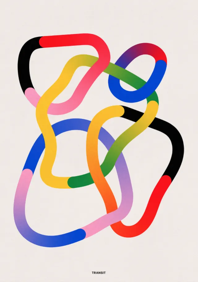
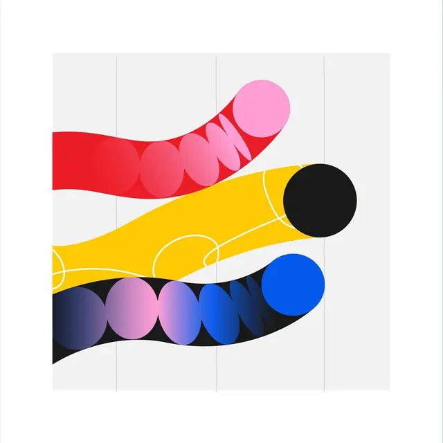
Vibrant abstract wordless mark made of curved, interlocking ribbon strokes in red, yellow, blue, green, pink, and purple against soft beige.
Summary
Abstract logo composed of four smooth, rounded ribbon strokes in saturated colors (red, yellow, blue, and purple-pink) weaving and looping through a compact square footprint against beige.
Visual description
Four thick, curved strokes in saturated primary and secondary colors interlock at overlapping nodes, creating the illusion of continuous weaving. The ribbon forms are rounded and organic, almost tubular, giving the mark depth despite its flatness. The palette cycles through red, vibrant yellow, bright blue, and deep magenta-purple with subtle color shifts at the overlaps. A small lowercase gray dash appears at the bottom center. The composition sits centered on a soft, warm beige background. The mark is wordless and legible even at small size due to the strong color blocks and smooth, flowing curves.
Key takeaway
The weaving logic is the core strength: by overlapping solid color strokes and letting them appear to pass above and below each other (via adjacency, not layer effects), the mark conveys motion and dimensionality without shading. The color palette uses full saturation with high contrast between adjacent colors, creating optical vibrancy. The mark works equally well as a standalone logo or pattern element.
Reuse notes
Ideal for creative, youthful, or culturally diverse brands. The abstract, non-literal form gives it broad applicability across sectors (tech, education, creative services, nonprofits). Strong in digital contexts and social media where its vibrant color reads well. Print effectiveness depends on output quality: colors will shift if color-separated or reduced to CMYK incorrectly.
More like this


Keep what you find
A free account saves references to boards and can send you a weekly email of picks based on what you save.
To see every result, go Pro.