Preview image. Unlock full-res
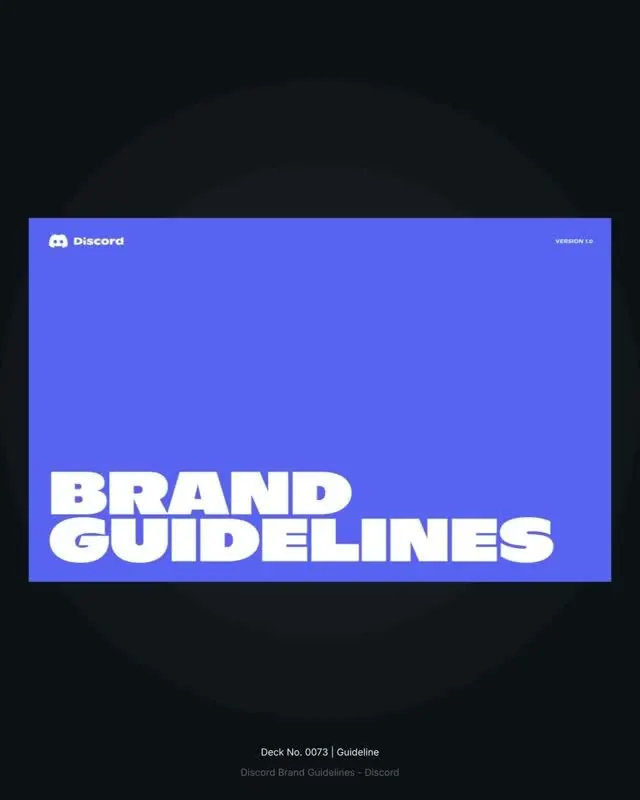
A brand-guidelines cover slide: a blurple landscape card holding heavy condensed all-caps BRAND GUIDELINES bottom-left, with the Discord logo and a version tag, floating on dark grey.
Summary
The title card of a Discord brand-guidelines deck: a wide blurple card with heavy condensed all-caps "BRAND GUIDELINES" anchored to the lower-left, presented inside a dark grey frame.
Visual description
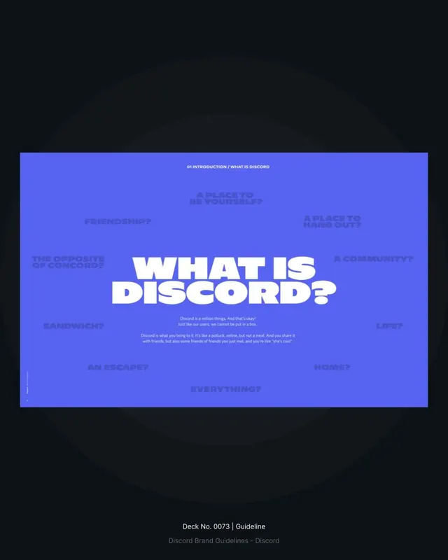
A near-black background with a faint concentric radial glow holds a single landscape card filled with Discord's blurple (a violet-leaning blue). Top-left of the card the white Discord logo and wordmark sit small; top-right a tiny "VERSION 1.0" label balances it. The headline "BRAND" over "GUIDELINES" is set in a very heavy, slightly condensed white sans, all-caps, packed tight and pushed into the bottom-left corner so it bleeds toward the edges. Below the card, small caption text reads "Deck No. 0073" and the deck title in muted grey. The palette is strictly blurple, white, and dark grey with no third accent.
Key takeaway
The corner-anchored oversized headline: shoving heavy all-caps type into one corner of a full-bleed color block, rather than centering it, gives a title slide tension and confidence. Pairing the small top-corner logo and version tag with that mass keeps it documentary and on-brand without clutter.
Reuse notes
A clean template for any guideline, report, or pitch cover where one brand color should dominate. Swap the blurple for the client's primary and keep the white-on-color contrast. The condensed weight needs real size to feel intentional, so do not scale the headline down or it loses the impact.
More like this





Keep what you find
A free account saves references to boards and can send you a weekly email of picks based on what you save.
To see every result, go Pro.