Preview image. Unlock full-res
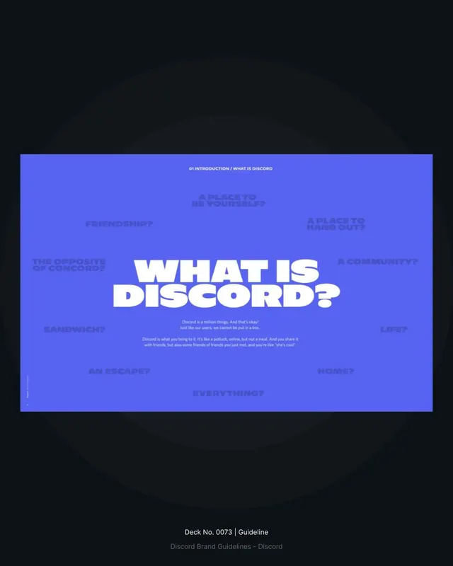
A brand-guideline intro slide that centers a chunky white headline question on a saturated periwinkle field, ringed by faded alternative questions and two lines of body copy.
Summary
A landscape brand-guideline slide on a flat periwinkle ground, with a heavy white display headline reading "WHAT IS DISCORD?" anchored at center and a halo of low-contrast tonal questions scattered around it.
Visual description
The slide sits as a 16:9 card mocked up on a near-black backdrop with a faint concentric vignette behind it. A small all-caps running header, "01 INTRODUCTION / WHAT IS DISCORD", tracks across the top. The center holds a two-line condensed bold headline in white, slightly drop-shadowed off the periwinkle. Surrounding it, set in the same periwinkle a few shades darker so they nearly vanish, are alternative questions ("FRIENDSHIP?", "A PLACE TO HANG OUT?", "AN ESCAPE?", "EVERYTHING?") arranged loosely around the edges like a thought cloud. Two short centered lines of light body copy sit just under the headline. A tiny page number and footer label anchor the lower-left.
Key takeaway
Build a single-color slide and create depth purely through tonal contrast: ghost the secondary copy in a darker shade of the same background so it frames the bold white headline without competing. Scatter the alternative phrasings as a halo to dramatize an open question before the deck answers it.
Reuse notes
A strong opening or section-divider pattern for brand decks, pitch intros, or manifesto pages where one big question carries the slide. The monochrome-plus-white approach reskins instantly to any brand hue. Keep the ghosted ring readable enough to scan but quiet enough not to fight the headline; too much contrast and it becomes noise.
More like this






Keep what you find
A free account saves references to boards and can send you a weekly email of picks based on what you save.
To see every result, go Pro.