Preview image. Unlock full-res
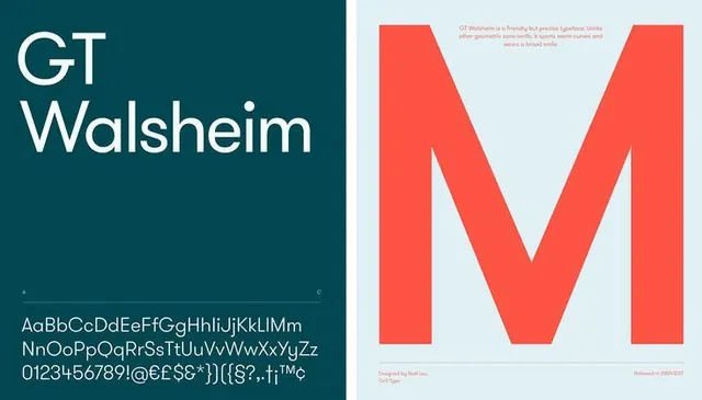
Type specimen for GT Walsheim split across a teal left panel with stacked sans-serif text and a coral right panel dominated by a massive letter M, with a light blue backing.
Summary
Type specimen for GT Walsheim presented across two contrasting panels: a teal left side with stacked sans-serif text and character set, and a coral right side featuring an oversized letter M against a light blue background.
Visual description
Left panel: dark teal background occupying roughly one-third of the composition, with "GT Walsheim" stacked vertically in white sans-serif capitals, taking up the upper portion. Below sits a multi-line character set in smaller white sans-serif showing uppercase, lowercase, numbers, and special characters, all set in the font family being presented. Right panel: light blue background covering two-thirds of the width with a monumental coral-red letter M spanning most of the vertical height, rendered in bold sans-serif. Small descriptive text in serif gray appears in the top-right corner and bottom-right corner, providing metadata about the specimen. The composition is a clean left-right split, balancing dense information (left) with dramatic scale (right). No additional imagery, colors beyond the stated palette, or decorative elements. Typography is the sole focus, with the oversized M demonstrating the font's weight and presence at display scale.
Key takeaway
The split-panel layout efficiently demonstrates two aspects of a typeface: functional usage (character sets and stacked text) against aspirational scale (the dominant letterform). High-contrast complementary colors (teal and coral-orange) create excitement and visual separation without compromising legibility. Mixing display scale with small-scale reference material in one composition shows restraint and practical thinking. The choice to anchor the right panel with a single bold letter makes the font feel confident and authoritative. This layout pattern works for any display typeface family.
Reuse notes
Perfect template for showcasing geometric or bold display typefaces. The teal-coral color pairing is striking but can be swapped to match a brand identity. The left panel scale works for both full alphabets and abbreviated character sets. Use when you need to demonstrate a font at multiple scales within one frame. Works well in design publications, brand guidelines, and portfolio presentations. The composition works equally well inverted (coral left, teal right) or with alternative color pairings so long as contrast is maintained.
More like this




Keep what you find
A free account saves references to boards and can send you a weekly email of picks based on what you save.
To see every result, go Pro.