Preview image. Unlock full-res
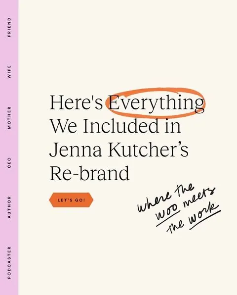
A cream-and-pink announcement tile with a four-line serif headline, a freehand orange circle emphasizing one word, a hexagon CTA button, and a pink sidebar listing role identities.
Summary
A personal-brand announcement poster announcing a re-brand, combining a refined serif headline with freehand mark-making, a hexagon call-to-action, and a sidebar listing professional identities.
Visual description
The layout anchors on a warm cream field. A narrow vertical strip down the left edge is filled with pale lavender-pink and carries five role words set in spaced capitals reading sideways: PODCASTER, AUTHOR, CEO, MOTHER, WIFE, FRIEND. The main headline spans four lines in a refined black serif typeface, with a loose orange marker oval drawn freehand around the word "Everything" for emphasis. Below the headline sits a terracotta hexagon button labeled LET'S GO! in bold caps. To its right, a handwritten black script phrase angles upward reading "where the work meets" with underline flourishes. Generous white space throughout prevents visual noise despite the layered typography and hand annotations.
Key takeaway
The freehand marker circle over a single serif headline word, which adds personality and human touch to formal typography without requiring illustration. A vertical sidebar containing stacked identity or role labels adds narrative depth without cluttering the central message. The three-voice typographic system (refined serif, casual handwritten script, geometric button font) works because each voice occupies its own spatial zone and functional purpose.
Reuse notes
Ideal for personal-brand announcements, course or product launches, or newsletter headers where warmth and authenticity matter. The hand-drawn elements must feel genuinely manual, not a clean font pretending to be handwritten, or the charm evaporates. Keep the sidebar roles short and scannable. The cream-plus-one-accent-color constraint ensures hand annotations stay prominent.
More like this
Keep what you find
A free account saves references to boards and can send you a weekly email of picks based on what you save.
To see every result, go Pro.