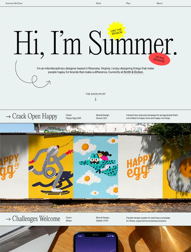
Preview image. Unlock full-res
Colorful hand-drawn wordmark and icon suite over minimalist sans-serif and muted earth-tone body layout.
Summary
Colorful hand-drawn wordmark and icon suite over minimalist sans-serif and muted earth-tone body layout.
Visual description
The hero uses large handwritten "Hi, I'm Summer." text at top, paired with a bold solid-red circular form (sun or accent). Below, three horizontally stacked panels showcase illustrated icons: a striped yellow umbrella, blue and green geometric shapes with "HAPPY" in blocky yellow, and a teal circular element. These panels sit above a moody composition showing warm wooden shelving with blue objects. A sans-serif footer reads "Craft Your Home" plus subtext. Earthy beige, muted greens, blues, and warm browns dominate; red punctuation marks the hero accent.
Key takeaway
Hand-drawn letterforms paired with cleanly bounded geometric icons creates personality without chaos. The panel-based approach lets each service or concept breathe separately while tying together through consistent illustrative language. The shift from bright, energetic icon section to muted moody product photography below shows tonal range within one voice.
Reuse notes
Ideal for creative services, freelance studios, or artisan brands seeking approachability. The hand-drawn element softens corporate minimalism; the modular icon system scales across applications (web, print, social). Beige backgrounds anchor playful colors without overwhelming. The tonal shift works for portfolios needing both aspirational (polished products) and behind-the-scenes (maker ethos) photography.
More like this
Keep what you find
A free account saves references to boards and can send you a weekly email of picks based on what you save.
To see every result, go Pro.