Preview image. Unlock full-res
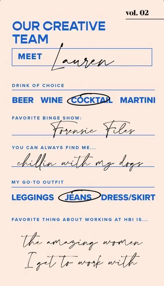
A minimalist one-page personal or team introduction alternating bold blue sans-serif labels with flowing black script handwriting over a warm beige background.
Summary
A one-page team or personal identity labeled "vol. 02" using bold blue sans-serif headers paired with flowing black script responses, separated by horizontal rules on a soft beige ground.
Visual description
The sheet opens with "OUR CREATIVE TEAM" in large blue sans-serif at the top, followed by a "MEET" label in a blue-outlined box with "Lauren" in black script overlaid, creating a playful collision. Six rows below each have a blue capitalized label ("DRINK OF CHOICE", "FAVORITE BINGE SHOW", "MY GO-TO OUTFIT", etc.) followed by a combination of blue sans-serif words separated by pipe characters and black handwritten script phrases. Words like "COCKTAIL" and "JEANS" are circled in black ink. Horizontal blue rules separate each section. The overall spacing is generous, emphasizing the contrast between the crisp geometric type and the loose, organic handwriting.
Key takeaway
The juxtaposition of rigid sans-serif with loose handwriting for personality, the circled emphasis technique for focal words, and the rule-based segmentation that keeps information readable while staying visually playful.
Reuse notes
Strong template for personal portfolios, team bios, or casual professional intros. Works best when the handwritten script is genuinely hand-lettered (or convincingly mimicked). The blue-and-black palette is warm and approachable without being juvenile.
More like this

Keep what you find
A free account saves references to boards and can send you a weekly email of picks based on what you save.
To see every result, go Pro.