Preview image. Unlock full-res
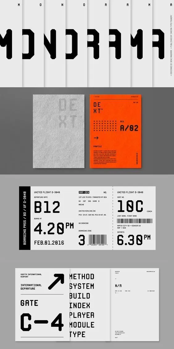
A modular type system specimen showing a bold geometric sans-serif in black, white, and bright orange across technical documentation, ticketing, and informational layouts.
Summary
A modular type system specimen showing a bold geometric sans-serif in black, white, and bright orange across technical documentation, ticketing, and informational layouts.
Visual description
The composition is divided into sections showcasing the typeface across different use cases. At the top, the word "MONOGRAM" is repeated in black letters separated by vertical white stripes, creating a rhythm and demonstrating the typeface's geometric forms. Below, a grid of sample applications includes envelope branding in white and grey on grey background, an orange poster with black type and orange dot patterns, airline boarding tickets with black type and barcodes on white background, and a wayfinding sign using the typeface with an arrow in black on white. All type is rendered in a condensed, geometric sans-serif with consistent stroke weight. The palette remains rigidly monochromatic in black, white, and neutral greys, with bright safety orange as the single accent color. The layout is highly structured with clear grids and generous white space between sections.
Key takeaway
A single bright accent color (here, aviation-orange) against black and white creates instant visual hierarchy without adding complexity. Geometric sans-serif typefaces feel authoritative and technical; they pair naturally with structured grids and minimal supporting elements. Demonstrating a typeface across multiple real-world applications (wayfinding, documentation, ticketing) in a single layout builds confidence in its versatility. The monochromatic base ensures the accent color reads as intentional rather than decorative.
Reuse notes
Excellent template for technical products, developer-facing brands, or transportation/aviation contexts. The black-white-orange palette evokes reliability and caution, lending itself to security, logistics, or infrastructure industries. Works best when the accent color has meaning (orange for alerts or warmth, blue for trust, etc.). Keep secondary information (captions, metadata) in neutral grey to avoid competing with the accent color. Geometric sans-serifs can feel cold; pair with generous spacing and breathing room to maintain approachability.
More like this




Keep what you find
A free account saves references to boards and can send you a weekly email of picks based on what you save.
To see every result, go Pro.