Preview image. Unlock full-res
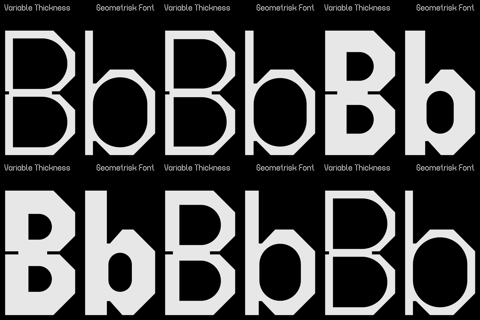
Display typography specimen showing a geometric sans-serif font with variable stroke widths, demonstrating how weight changes create visual interest within a single typeface system.
Summary
Display typography specimen showing a geometric sans-serif font with variable stroke widths, demonstrating how weight changes create visual interest within a single typeface system.
Visual description
Against a pure black background, two large white letterforms (a stylized "D" and "b") occupy most of the frame. The geometric construction uses chamfered corners (45-degree bevels) at joints and terminals, giving the letters a technical, almost architecture-drawing quality. The stroke widths vary throughout each letter, creating rhythm and movement. A thin outline traces the exterior while thicker interior strokes build form, making the letters appear sculpted or layered. At the top, white lowercase text labels "Variable Thickness" (left) and "Geometrisk Font" (right) describe the specimen. The pure contrast and generous scale elevate the typography to sculptural status.
Key takeaway
Variable stroke weight within a single letterform creates sophistication without compromising readability. Geometric construction with beveled corners conveys precision and technical confidence. Using a black-and-white specimen with only scale and weight variation forces focus on letterform quality over color.
Reuse notes
Ideal reference for technology, developer-tool, fintech, or data-science brands seeking authoritative, precise typography. The geometric construction and high contrast translate well to UI/UX design systems and technical documentation. Works exceptionally well for brands emphasizing modularity or systematic thinking. Not suited for warm, approachable, or humanitarian contexts. Strong for display/headlines in corporate, architectural, or scientific verticals.
More like this







Keep what you find
A free account saves references to boards and can send you a weekly email of picks based on what you save.
To see every result, go Pro.