Preview image. Unlock full-res
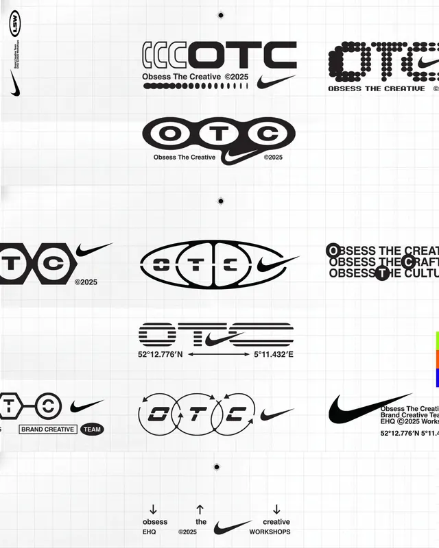
Nike OTC (Obsess The Creative) logo exploration gridsheet showing 12 distinct geometric variations of a monogram and wordmark, sketched on a blueprint grid.
Summary
A design-system gridsheet for Nike OTC showing 12 monogram and wordmark variations in black geometric type on a light blueprint grid, with notes on team and brand-creative guidelines.
Visual description
The sheet is printed on a standard engineering grid (light gray lines) in landscape. Variations are laid out in four rows of three: some show the OTC letters as interlocking circles with the Nike swoosh, others as stacked block letters, and others as outlined letterforms with thin connectors. Each iteration is rendered in black strokes or solid fills at roughly the same size. At the top, the primary lockup "OTC" sits alongside "Obsess The Creative" text and coordinates (52°12.776'N 5°11.432'E). Below the gridsheet are smaller sketches, labels for "BRAND CREATIVE" and "TEAM", and corner notes on brand identity rules. The Nike swoosh appears as a modular element integrated into multiple wordmark variations.
Key takeaway
The systematic presentation of a single monogram across many geometric interpretations, making clear how the same letters can shift from interlocking to stacked to outlined while staying recognizable. The use of a grid and coordinate notation as part of the brand identity itself, suggesting precision and methodology. The consistent stroke weight and black-and-white-only execution keeps the palette tight and copy clear.
Reuse notes
A reference for logo-design explorations and system thinking, especially for brands with modular or geometric letterforms. The gridsheet format is useful when presenting multiple directions to stakeholders side-by-side. Works well for consulting and creative agency identities where showing the thinking and rigor is part of the brand story.
More like this





Keep what you find
A free account saves references to boards and can send you a weekly email of picks based on what you save.
To see every result, go Pro.