Preview image. Unlock full-res
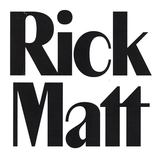
Large-scale black sans-serif type specimen stacked vertically, showcasing bold letterforms with consistent geometric stroke weight against white.
Summary
Large-scale black sans-serif type specimen stacked vertically, showcasing bold letterforms with consistent geometric stroke weight against white.
Visual description
White background. Two lines of black sans-serif type stacked vertically and centered: "Rick" (upper), "Matt" (lower). Both use a heavy display font with uniform stroke weight and geometrically precise letterforms. Counters are open and clean; curves and angles read as contemporary and confident. A small black circle accents the top-right of the R in Rick. No other visual elements, decoration, or supporting text. Pure typography with commanding presence through scale and weight alone.
Key takeaway
The unadorned letterform specimen approach (no framing, no gradient, no effects). The single accent dot as a minimal brand mark adds personality without complexity. The centered stacked layout proves that contemporary sans-serif display faces work without additional visual support. The monochromatic treatment emphasizes letterform quality.
Reuse notes
Strong reference for naming/identity systems in tech, design, or creative fields. Works well as a logotype or wordmark base. Only effective if the typeface itself is distinctive; a generic sans-serif would read as generic. Could be applied to any brand name of 2-3 words per line.
More like this





Keep what you find
A free account saves references to boards and can send you a weekly email of picks based on what you save.
To see every result, go Pro.