Preview image. Unlock full-res
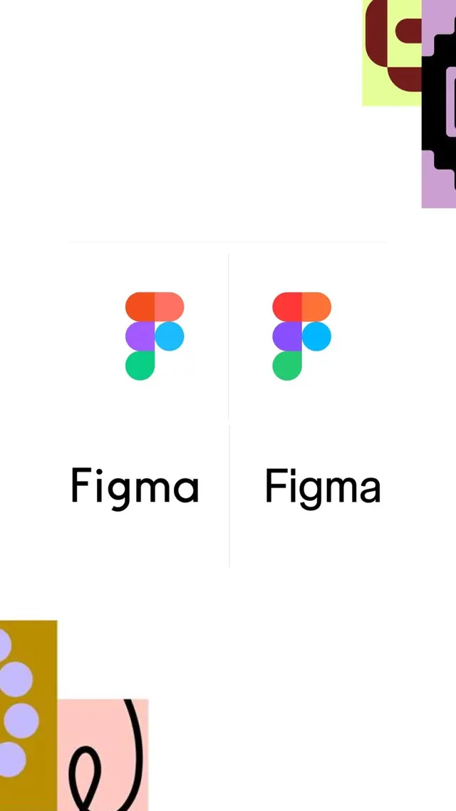
Side-by-side comparison of two Figma logo lockups, contrasting an older rounded mark with a sharper revised one, framed by brand-color shapes bleeding in from the corners.
Summary
A before-and-after of the Figma logo, two near-identical stacked-circle marks above the "Figma" wordmark, set side by side and separated by a thin vertical hairline so the subtle revision can be compared.
Visual description
The center of a white canvas holds two logo lockups divided by a faint vertical rule and capped top and bottom by short horizontal rules. Each lockup is the familiar Figma mark, five colored shapes (orange and salmon caps, a purple square, a blue circle, a green half-circle) stacked into an F, above a lowercase geometric sans wordmark. The right version reads slightly bolder and more saturated with crisper corners than the softer left version. The composition is deliberately sparse, with the comparison floated in a sea of negative space. Decorative brand-color blocks crop into the corners: a black-on-lime pixel shape top-right, an ochre block with lilac dots and a pink panel with a black squiggle bottom-left, framing the clinical comparison with playful chrome.
Key takeaway
The hairline-divided side-by-side is a clean way to present an "old vs new" identity change without labels; the rules alone signal "compare these." Floating the subjects in heavy white space lets a tiny refinement read as significant. Letting saturated brand fragments bleed in from the corners keeps an otherwise sterile comparison page on-brand and lively.
Reuse notes
Reach for this layout in a rebrand case study, changelog, or design-system doc announcing a refined mark. The corner-bleed shapes are the move worth porting to any brand; pull them straight from the identity's own palette. Works best when the two versions are genuinely close, so the viewer leans in to spot the difference.