Preview image. Unlock full-res
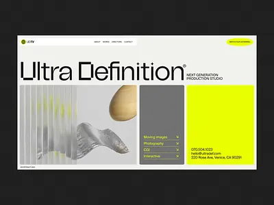
A motion-production studio homepage featuring layered geometric compositions, abstract ribbons, and high-contrast yellow-green accent against dark and neutral tones.
Summary
A motion-production studio homepage featuring layered geometric compositions, abstract ribbons, and high-contrast yellow-green accent against dark and neutral tones.
Visual description
A two-column layout with the left side in white showing vertical wavy ribbons and a soft gradient sphere (peach/tan tones), and the right side a bold brightness-yellow rectangle containing contact copy and address. The hero headline "Ultra Definition" spans both sections in a bold geometric sans-serif. A pale gray column of smaller compositional elements anchors the center. Navigation sits in the top-left corner. The overall effect is one of clean, modular composition where abstract shapes and type create visual interest without clutter. Ample white space frames the elements, and the single bright accent color commands attention.
Key takeaway
The two-column split with one accent color creates visual hierarchy without competing elements. Pairing abstract geometric forms (ribbons, spheres) with severe typography reads as sophisticated and motion-forward. The white-space-heavy approach makes dense information (type, address) feel breathable and intentional.
Reuse notes
Ideal for motion, design, or production studios wanting to appear premium and modern. The yellow-green accent works particularly well against white/gray for tech or forward-thinking creative businesses. The modular composition is flexible enough to accommodate different content widths without losing balance.
More like this


Keep what you find
A free account saves references to boards and can send you a weekly email of picks based on what you save.
To see every result, go Pro.