Preview image. Unlock full-res
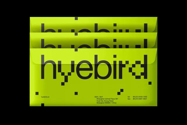
Minimal business collateral for design studio using bright lime yellow and charcoal gray, layered in horizontal offset panels to suggest depth.
Summary
Minimal business collateral for design studio using bright lime yellow and charcoal gray, layered in horizontal offset panels to suggest depth.
Visual description
Three identical wordmark compositions ("huyebird" in heavy lowercase sans-serif) arranged in horizontal offset stacks against bright lime yellow. Dark charcoal gray letterforms are grouped with precise geometric letterforms (note the pixel-like glitch or accent detail on the final letters). The offset stacking creates a subtle 3D illusion, where each panel sits slightly lower and to the right. Contact information in small type (address: Shanghai Central Plaza; phone/fax details; domain hyebird.cn) appears in the lower left section, integrated into the geometric composition. Black framing edges contain the yellow-field color, emphasizing its high saturation.
Key takeaway
The offset-layer stacking technique creates perceived depth and movement without actual dimensionality, giving a flat design a dynamic, slightly tactile quality. Repeating the same wordmark across the system reinforces brand identity while the staggered placement keeps it visually interesting. The color restraint (two colors only: lime and charcoal) makes the geometric letterforms the unmistakable centerpiece.
Reuse notes
Ideal for design studios, creative agencies, or tech-forward brands targeting a younger, design-conscious audience. The high-contrast, neon color approach demands strong typography and careful spacing to avoid chaos. Works well on collateral systems (business cards, letterhead, envelopes) where repetition and stacking are natural. Caveat: the extreme neon saturation requires careful material choices in print; digital color management is essential.
More like this



Keep what you find
A free account saves references to boards and can send you a weekly email of picks based on what you save.
To see every result, go Pro.