Preview image. Unlock full-res
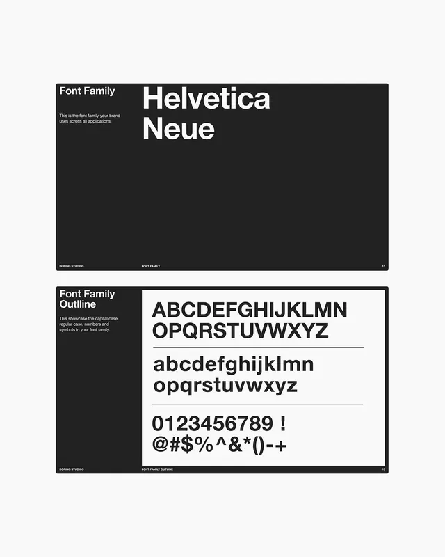
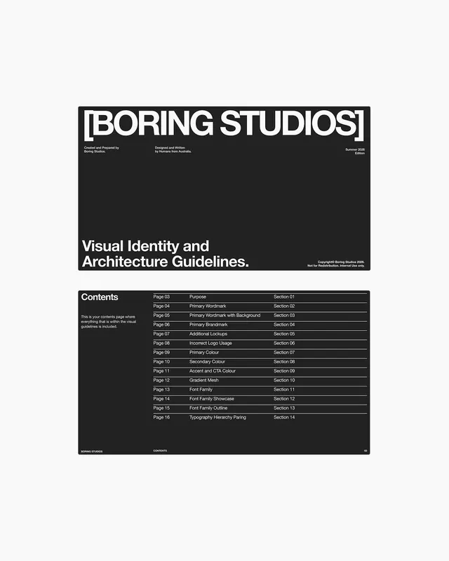
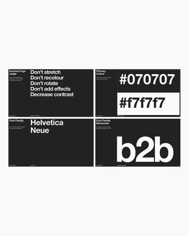
Two stacked Swiss-style brand-guideline pages specifying Helvetica Neue, one naming the family in large type, the other showing its full upper and lowercase alphabet, numerals and symbols.
Summary
Two brand-guideline slides specifying a brand's typeface as Helvetica Neue: one is a black page titled "Font Family" with the name set huge in white, the other shows the full alphabet and characters in a white panel.
Visual description
Two landscape slides are stacked vertically on a pale-grey ground. Each uses a slim left column of small white labels ("Font Family", a sentence of caption copy) against the black field, with the showcase content filling the larger right zone. The top slide reads "Helvetica Neue" in two oversized lines of white sans-serif. The bottom slide ("Font Family Outline") inverts to a white card holding the capitals A to Z, the lowercase a to z, the digits 0 to 9 and a symbol row, divided by thin black hairline rules. Both slides carry a running footer ("Boring Studios", the page label, a page number 13 and 15) along the bottom edge in tiny caps.
Key takeaway
The black-page-then-white-card pairing that introduces a typeface large, then proves it with the full glyph set. The persistent thin label column plus a footer of file name, section and page number that makes every slide feel like part of a numbered system.
Reuse notes
A clean template for the typography section of a brand book or pitch deck. Works for any sans-serif, not just Helvetica. Reach for it when you want the type itself to be the only visual, with no color or imagery competing. The footer convention scales to a whole deck.
More like this





Keep what you find
A free account saves references to boards and can send you a weekly email of picks based on what you save.
To see every result, go Pro.