Preview image. Unlock full-res
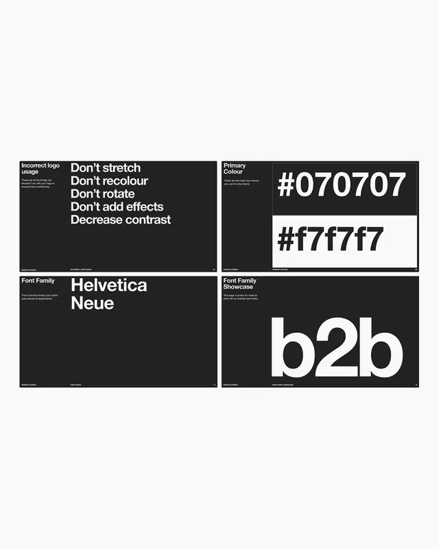
Four black brand-guideline slides on a white field, covering incorrect logo usage, primary hex colours, and the Helvetica Neue font family in stark monochrome Helvetica.
Summary
A four-up grid of brand-guideline slides from a template, each a black landscape card on a white background, walking through logo dos-and-donts, primary colours, and the typeface in flat Helvetica.
Visual description
Four 16:9 black slides sit in a 2x2 arrangement on a near-white page. Top left, an "Incorrect logo usage" slide lists "Don't stretch / recolour / rotate / add effects / decrease contrast" as a left-aligned white type list. Top right, "Primary Colour" shows two stacked swatches labelled #070707 and #f7f7f7, the second rendered as a white block. Bottom left, "Font Family" displays "Helvetica Neue" large beside a one-line caption. Bottom right, "Font Family Showcase" sets a giant lowercase "b2b". Every slide carries a small section title and short caption top left and a thin running footer with studio name, page label, and slide number.
Key takeaway
Lock each guideline topic into the same template skeleton: tiny title plus caption top-left, one oversized hero element centred, and a consistent running footer with page numbers. Express the brand entirely through one weight of Helvetica and a black/white pair, letting the system itself be the brand voice.
Reuse notes
A clean starting frame for a quick brand book, deck, or design-system intro where you want structure over decoration. The black-card-on-white presentation reads well as a portfolio mosaic. Caption text is small, so confirm legibility before printing or projecting.
More like this





Keep what you find
A free account saves references to boards and can send you a weekly email of picks based on what you save.
To see every result, go Pro.