Preview image. Unlock full-res
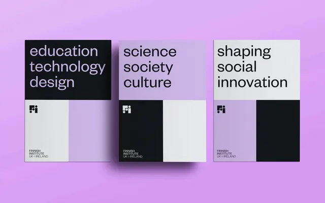
Three-panel editorial system with mission-driven copy on dark and light ground blocks against lavender background, centered on academic identity.
Summary
Modular editorial campaign for the Finnish Institute showing three thematic panels with contrasting text color and background blocks, unified by lavender surround and monolithic type.
Visual description
Lavender background containing three equal-width card compositions arranged horizontally. Each card pairs headline copy (left: black text on dark navy, center: black text on lavender, right: black text on off-white) with a two-block color arrangement below. Left panel: dark navy with white block. Center panel: lavender with black block. Right panel: off-white with navy block. The "Fi" logo mark anchors each lower-left corner, scaled consistently. Typography throughout is clean sans-serif, high-contrast and legible, emphasizing keywords like "education technology design", "science society culture", "shaping social innovation".
Key takeaway
The systematic use of opposing color pairs (dark ground/light text, light ground/dark text) to organize information while maintaining visual rhythm. The mechanical repetition of the logo mark as a structural element that unifies disparate color zones. The avoidance of complex layout in favor of stacked, transparent relationships between headline and color field.
Reuse notes
Ideal for institutional, nonprofit, or academic projects requiring a sense of order and sophistication. The high-contrast structure reads well at small sizes and translates effectively to digital and print media. Works particularly well when communicating multiple themes or initiatives that deserve equal visual weight.
More like this




Keep what you find
A free account saves references to boards and can send you a weekly email of picks based on what you save.
To see every result, go Pro.