Preview image. Unlock full-res
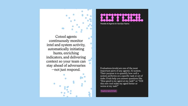
Split-panel branding for an AI agents product, pairing minimal prose copy on light blue with a bold magenta logotype and dark UI panel.
Summary
Split-panel identity concept for COTOOL, a SecOps AI agents platform, balancing calm educational copy against bold logotype.
Visual description
Left panel: cream background with soft blue particles scattered as texture, centered serif text explaining Cotool's continuous monitoring and threat-hunt capabilities. Right panel: black background with magenta COTOOL logotype in a chunky, geometric sans-serif, followed by product tagline and multi-line descriptive paragraph set in white body copy, closing with a filled magenta CTA button.
Key takeaway
The split-information layout separating value proposition from brand mark. The magenta accent creating visual pop against dark without overwhelming. The use of floating particle texture to add motion and visual interest to an otherwise text-heavy side.
Reuse notes
Strong for security product positioning where copy explains technical capability. The cool-to-dark color split works for technical or enterprise audiences. Magenta pairs well with dark blue for tech credibility.
More like this




Keep what you find
A free account saves references to boards and can send you a weekly email of picks based on what you save.
To see every result, go Pro.